UI/UX Design · Product Design

Doctify

Doctor booking that makes healthcare feel close — search, profiles, reminders.

Booking a doctor is a high-stakes task performed by someone who feels unwell. Doctify is designed for that person: fewer decisions, clearer profiles, and a reminder that arrives before they need it.
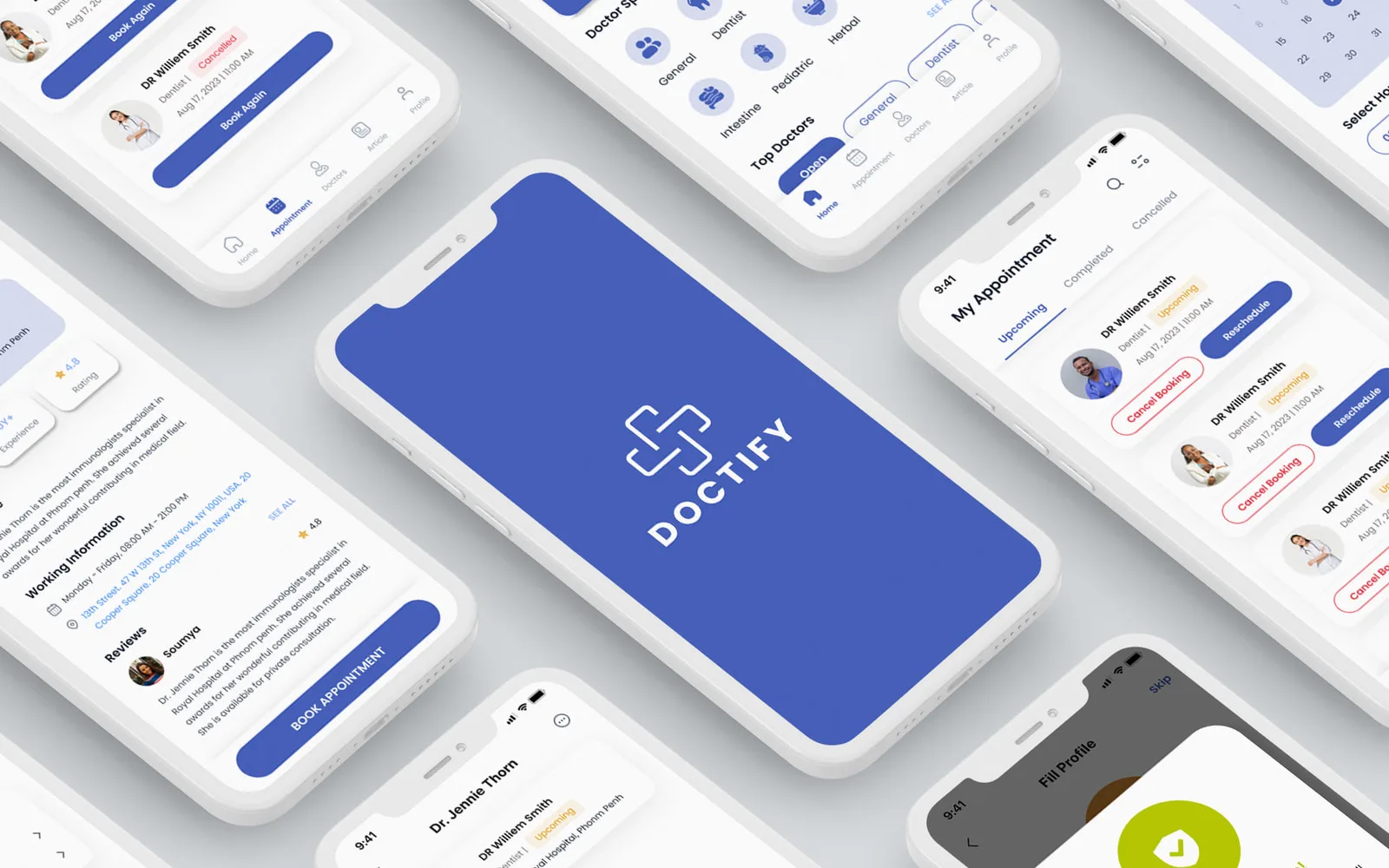
Doctify — the finished product
Role
Product Designer, User Experience Designer
Toolkit
Figma, Photoshop, Illustrator
Team
Soumya Sharma
Duration
June 2023 – Sept 2023

01 The brief

A whole healthcare network, and a phone to fit it on.

Doctify had to make finding and booking a doctor simple enough to do while feeling unwell.

The objective was one interface that carries the entire appointment — the search, the choice, the booking, and the reminder afterwards.

Doctify is a doctor-appointment booking app. My job was to craft an intuitive and aesthetically pleasing interface that streamlines the booking process end to end: explore a network of healthcare professionals, filter down to the right specialist, and make the appointment with confidence.

The point of all of it was access. Arranging healthcare is the least convenient thing most people have to do, and the interface is where that either gets better or gets worse. Five things had to be true before it could get better.

  • Parents
  • Busy professionals
  • Caregivers
  • Seniors
  • Medicine practitioners
  • Clinical researchers
  1. O-01

    Streamlined appointment booking

    Select an available date and time, review the choice, confirm — in that order, with nothing in between.

  2. O-02

    Intuitive search and filtering

    Find doctors by specialization, location, availability and the other criteria that actually narrow a search.

  3. O-03

    Clear doctor profiles

    Qualifications, experience, patient reviews and availability, organised so the choice is easy to make.

  4. O-04

    Personalization and feedback

    Save favourite doctors, set preferences, leave a review — the platform learns who it belongs to.

  5. O-05

    Appointment reminders

    A notification system that keeps people informed about what is coming, and keeps no-shows down.

02 Research

Two people needed the same screen for opposite reasons.

User interviews, surveys and usability testing put patients on one side of the appointment and healthcare providers on the other.

Patients told me booking was convoluted. Providers told me they had nowhere to prove they were worth booking.

The research shaped the interface and the product strategy together. Patients were frustrated by convoluted booking processes, and just as frustrated by how hard it was to find a specialist for their specific requirement. That is what pushed the design toward a system where you pick an available date and time, review the choice, and confirm — a sequence short enough to finish while unwell.

The other half came from the healthcare providers. They needed a platform where their qualifications and experience could actually be seen. So the doctor profile stopped being a row in a list and became a screen of its own: qualifications, experience, patient reviews and availability, visually organised and digestible, which turned out to serve the patient's confidence as much as the provider's case.

Both findings are the same finding from two directions: the information existed, and no interface had bothered to organise it.

A booking app only looks like a form. It is really the ten seconds in which somebody decides to trust a stranger with their health.

03 The design

Structure first, then the sketch, then the system.

The flow decided what the app was, the sketch what the screens were, and the system what all of it looked like.

The map I designed to

information architecture + primary flow

Onboarding sign up · sign in · forgot password

  1. F-01 Home the landing
    • Search
    • Upcoming appointments
    • Doctor speciality
    • Top doctors
  2. F-02 Appointments the booking, after it exists
    • Upcoming
    • Completed
    • Cancelled
  3. F-03 Doctors the whole network
    • Suggested
    • Search doctors
  4. F-04 Articles the reason to open it between visits
    • Medical updates
  5. F-05 Profile the account, and the reminders
    • Profile settings
    • App settings
    • About us
    • Log out

Five destinations on the bottom bar and nothing hidden behind a menu. Search sits on the home screen rather than inside one of the five, because a person who already knows the name of their doctor should not have to guess which tab that lives under. Everything that happens after a booking — upcoming, completed, cancelled — lives in one place, since the appointment, not the doctor, is what brings people back.
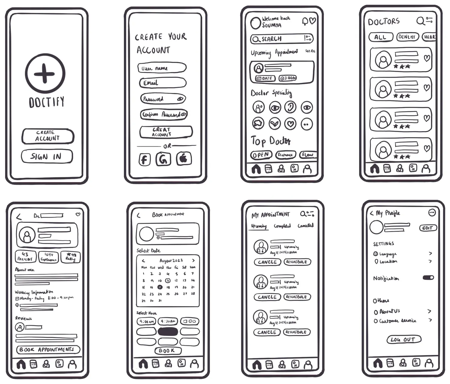
The whole app, sketched before anything got expensive.

the hand-drawn board The hand-drawn Doctify wireframe board: eight phone frames in two rows of four — the splash with the circled cross mark, Create Your Account with its four fields, the home screen with search, an upcoming appointment card, an eight-icon speciality grid and a five-icon bottom bar, the Doctors list with its chips and stars, the doctor profile with patients, experience and rating chips over About me, working information and reviews, Book Appointment with an August 2023 calendar and hour chips, My Appointment with its upcoming, completed and cancelled tabs, and My Profile with settings, a notification switch and log out
the hand-drawn board — frames 1 and 2 are getting in; frames 3 to 8 run home to profile
The whole app went onto one board of eight hand-drawn frames before anything got expensive: splash, account, home, doctors, the doctor, booking, appointments, profile. Eight frames is the whole product argued out in an evening. The board is where the five-destination bottom bar was settled, where the doctor stopped being a row in a list and became a screen, and where booking got cut down to two decisions and a button.

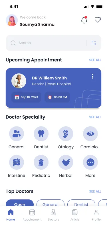
The home screen, finished.

final The finished Doctify home screen: welcome back Soumya Sharma with an avatar, a search field, an upcoming appointment card in brand blue showing the doctor, the date and 05:00 PM, an eight-tile doctor speciality grid, and the start of the top doctors row
final — the same order as the sketch, in the design system
This is the frame the rest hangs off, and its running order never changed after the sketch — what changed was that the appointment you already have got promoted into the one coloured card on the screen.

Colours borrowed from the room people already trust.

the Doctify colour system

  • Brand blue

    every primary action, every selected state, and the mark

    #4761BC
  • Secondary

    held back for one moment: the tick that says it is confirmed

    #B9C902
  • Text

    type — the only near-black in the app

    #1D1617
  • Periwinkle

    the calendar field and the card a doctor sits on

    #DADFF2
  • Warm neutral

    the quiet surface, where blue would be too clinical

    #FFF5E9
  • Paper

    the field everything else is measured against

    #FFFFFF

I chose soothing blues and clean whites — the colours people already associate with medicine — to convey professionalism and trust, and paired them with a clear, contemporary typeface so the whole app reads as one unified, inviting theme. In a healthcare context that consistency is not a style preference: it is what makes an app feel reassuring and accessible to somebody using it on a bad day.

And the parts that had to behave the same everywhere.

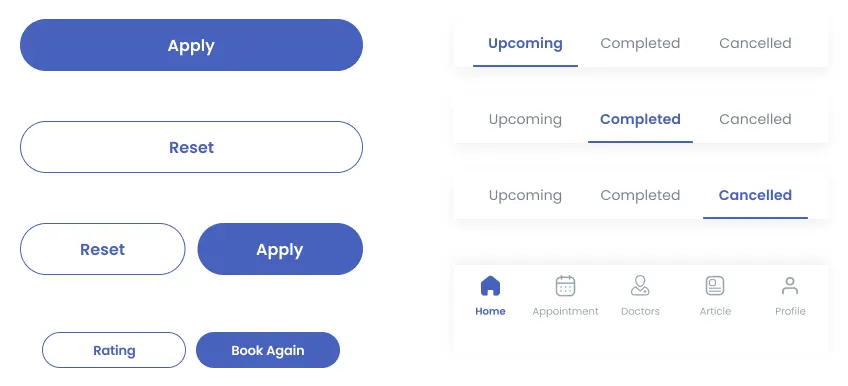
The Doctify component sheet: a solid Apply button, an outlined Reset button, a Reset and Apply pair, a Rating and Book Again pair, the Upcoming, Completed and Cancelled tab shown in each of its three selected states, and the five-icon bottom bar with home, appointment, doctors, article and profile
four button specimens, three tab states, one bottom bar
Poppins throughout. The appointment tab is specified in all three of its states rather than in one, because that control is the entire navigation of the history screen. The bottom bar holds at five icons; on a phone, every extra destination costs more than it carries.

04 Final screens

The app, as it ended up.

Ten screens carry all five: onboarding, home, booking, history, profile.

All five objectives from the brief land on one of these screens.

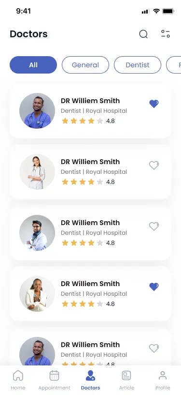
The doctors list leads with the specialty filter, because finding the right specialist was the harder half of the problem. The profile gives qualifications, experience, reviews and working hours a full screen and puts one action at the bottom of it. Booking is a calendar, a row of hour chips and a Next — pick, review, confirm.

Then the app takes on its second job: holding on to the appointment. Upcoming, completed and cancelled sit behind one control, each card carrying the two things people actually want from it, and the reminder that prevents a no-show turns out to be a single switch in the profile.

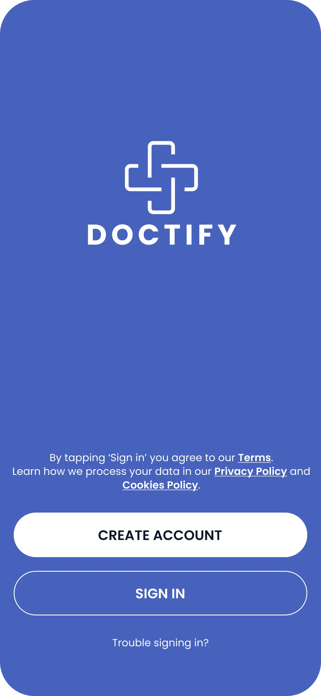
Getting in, in four screens.

launch The Doctify launch screen: the white cross mark and the DOCTIFY wordmark centred on a field of brand blue
launch — the mark, on the brand blue
the gate The Doctify sign-in screen: the mark on brand blue above a line saying that by tapping sign in you agree to the terms, with links to the privacy policy and cookies policy, a white Create Account button, an outlined Sign In button, and the words trouble signing in
the gate — create an account or sign in, with the terms above both
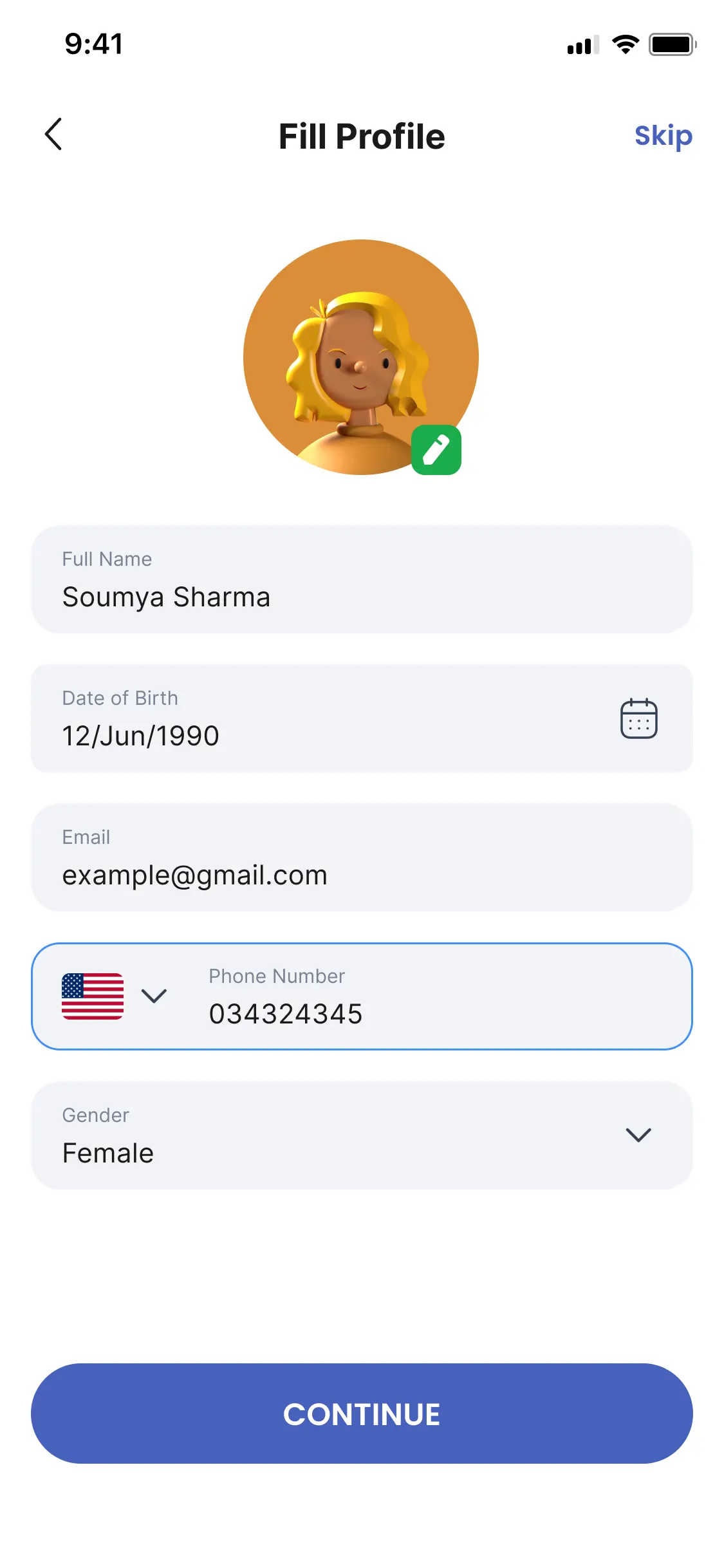
fill profile The Doctify Fill Profile screen: a back arrow, the title, and Skip in the corner, an avatar with an edit badge, and fields for full name, date of birth, email, phone number and gender above a Continue button
fill profile — five fields, and a Skip in the corner
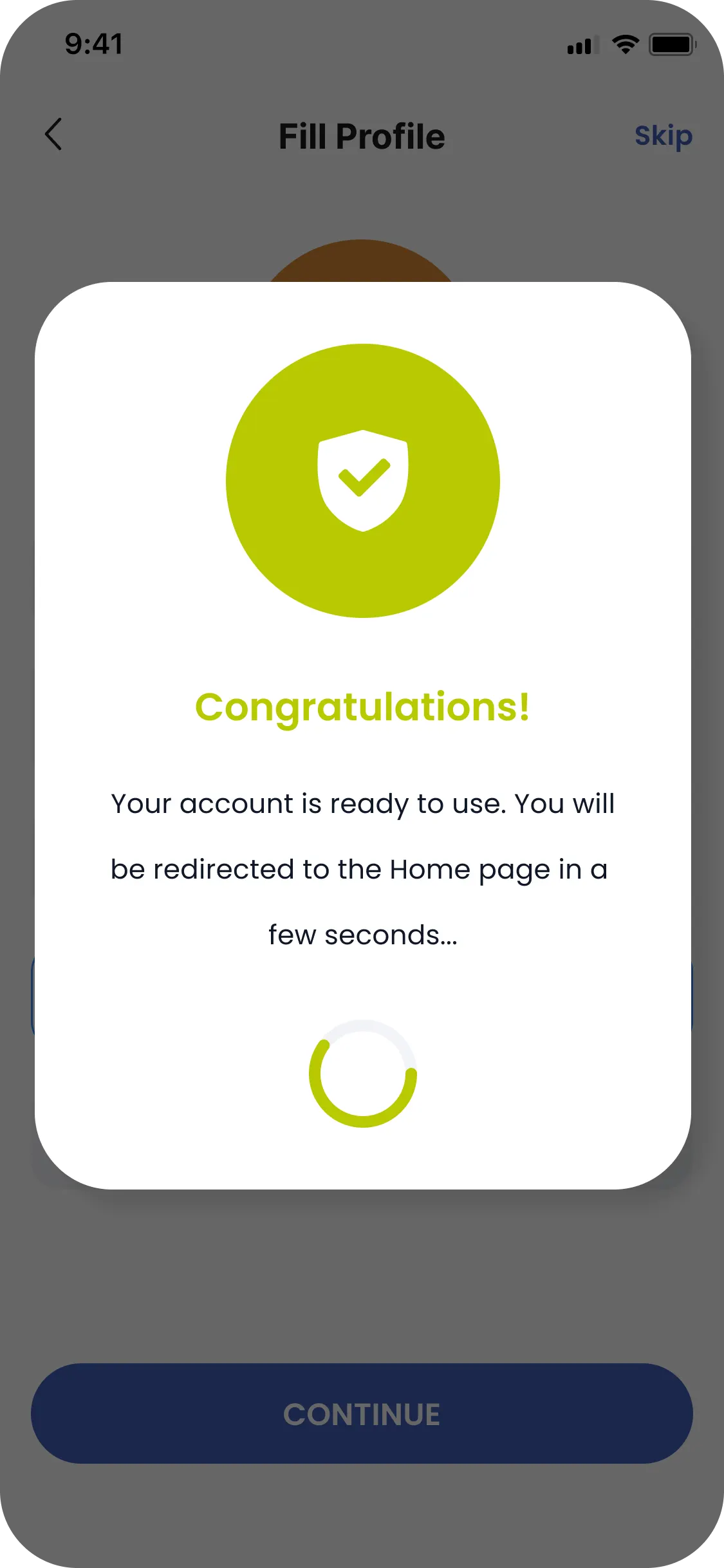
ready The Doctify confirmation over a dimmed Fill Profile screen: a white card with a green shield and tick, the word Congratulations, the line your account is ready to use and you will be redirected to the home page in a few seconds, and a loading ring
ready — it says what happens next, then does it
Registration was the thing testing pushed back on, so it is the part of the app with the most screens and the fewest questions on each: nothing is asked until there is an account to hang it on, the profile can be skipped outright, and the confirmation is the one place the secondary green is allowed out — the tick that says it worked.
The Doctify doctors screen: a search icon and filter icon in the header, a row of specialty chips with All selected, and a list of doctor cards each with a photograph, a name, the clinic, a 4.8 star rating and a heart to save them
browse — the network, narrowed by specialty
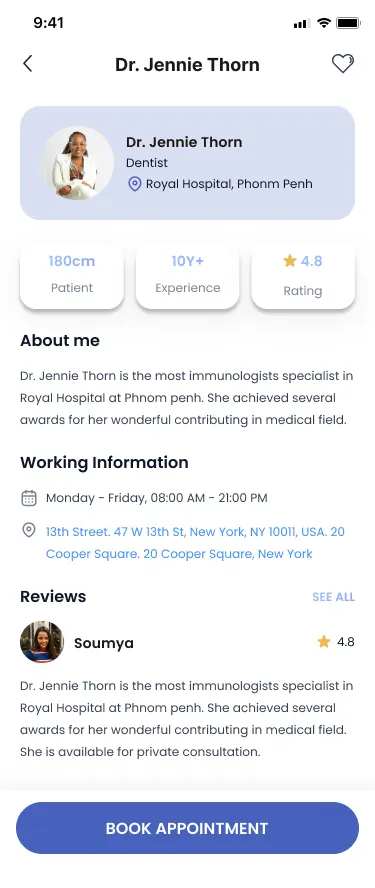
A Doctify doctor profile: Dr. Jennie Thorn, dentist at Royal Hospital, three summary chips including ten years plus experience and a 4.8 rating, an About me paragraph, working hours and address, a patient review, and a Book Appointment button
judge — experience, hours, reviews, one action
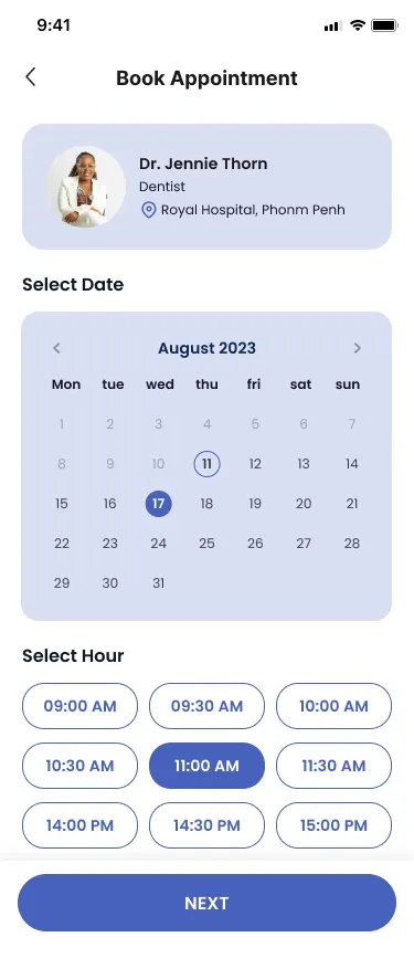
The Doctify booking screen: the chosen doctor at the top, an August 2023 calendar with the 17th selected, a grid of appointment-hour chips with 11:00 AM selected, and a Next button
choose — a date, an hour, and a Next
The booking spine is three screens long, and none of them asks a question that could have been answered on the one before. The chosen doctor rides along at the top of the calendar screen so that nobody has to remember who they are booking.
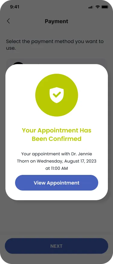
The Doctify confirmation: a card over the dimmed payment screen with a green tick, the words Your Appointment Has Been Confirmed, and the doctor, day, date and time written out underneath, above a View Appointment button
confirmed — the doctor, the day and the time, repeated back
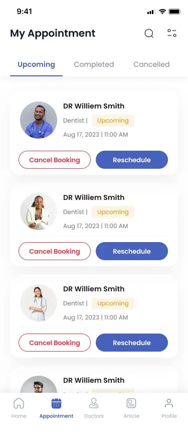
The Doctify appointment history on the Upcoming tab: cards for each booking with the doctor, an Upcoming label, the date and time, and a Cancel Booking and Reschedule button on every one
after — upcoming, completed and cancelled behind one control
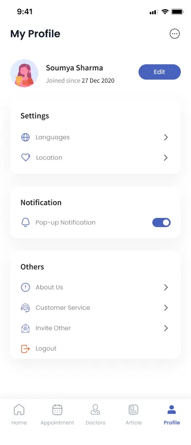
The Doctify profile screen: the account holder with the date she joined and an Edit button, settings for languages and location, a Notification section with the pop-up notification switch turned on, and links to about us, customer service, invite other and log out
reminders — the pop-up notification switch
The confirmation repeats the appointment back in full — doctor, day, date, time — because that is the sentence somebody will screenshot. The reminder pillar is one switch; the design work was making sure it sits where a person would think to look for it rather than in a settings screen nobody opens.

05 Testing

The sessions changed two screens.

Find a specific doctor, book an appointment, move around the app, then tell me what got in the way.

The tasks were deliberately ordinary: find a doctor, book them, and get back out.

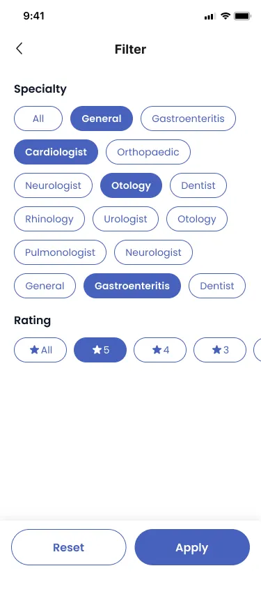
Participants worked through finding a specific doctor, booking an appointment and navigating the app's features. They appreciated the search filters — specialties, locations, availability — and then asked for more of them: sorting by patient reviews, filtering by insurance coverage. I expanded the filter options rather than defending the set I already had.

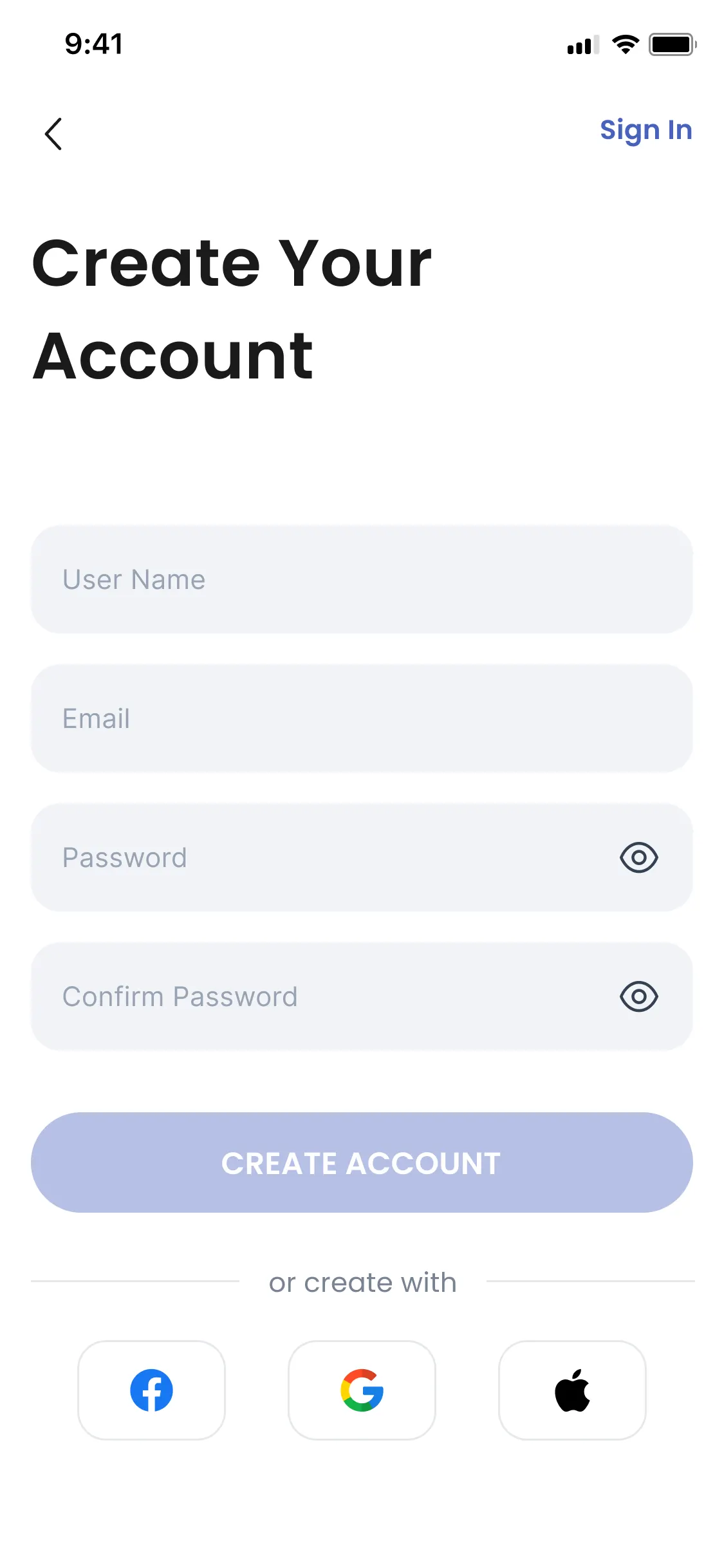
The other note was about the very beginning. Registration had to be more straightforward, so I streamlined the flow and gave it social sign-in alongside email. That change was well received in the sessions that followed.

expanded The Doctify filter screen: a Specialty section of sixteen chips over six rows — general, gastroenteritis, cardiologist, orthopaedic, neurologist, otology, dentist, rhinology, urologist, pulmonologist — with four of them selected, then a Rating row of star options with five stars chosen, and Reset and Apply buttons pinned at the bottom
expanded — specialty over six rows, and rating
streamlined The Doctify Create Your Account screen: user name, email, password and confirm password fields, a Create Account button, and a row of Facebook, Google and Apple buttons under the words or create with
streamlined — email, or one tap with an account you already have
Two changes out of the same instinct: people will tell you a screen is fine and then show you it isn't. One screen got longer because the choice mattered; the other got shorter because it didn't.

Testing didn't ask me to redesign anything. It asked me to add options in one place and take steps out of the other.

06 Reflection

What the work taught me.

In healthcare the layout is rarely the hard part. Deciding how much to say is.

Every hard decision on Doctify was a version of the same one: give people the essential medical information without overwhelming the interface, translate complex healthcare terms into user-friendly language without compromising accuracy, keep one booking flow simple across specialties that do not work the same way, and hold all of it inside healthcare data-privacy regulation — HIPAA and the rest — without making the app feel like a legal document.

What I take from it is that simplifying an intricate process and nurturing trust are the same job in healthcare, and that continuous testing and incorporated feedback are what settle it, not taste. What comes next is the same list I would give anyone: keep refining the interface, strengthen the privacy measures, widen the accessibility features, so that Doctify stays intuitive and becomes a trusted ally when somebody needs care.

  • information balance
  • plain language, exact meaning
  • one booking flow, many specialties
  • privacy that stays usable
  • testing over taste

An app people open when they feel unwell has to be legible at their worst, not at my best.