Interaction Design · Product Design

Siteimprove — Frontier

The learning platform I rebuilt for a SaaS company that sells accessibility.

Siteimprove helps other companies grow their traffic by making their sites accessible and searchable. Frontier is its learning management system — the place customers go to actually learn the product, and the standards behind it.

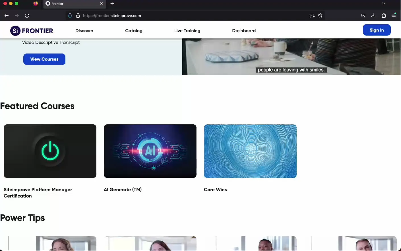
Siteimprove — Frontier — the finished product
Role
Interaction Designer, User Experience Designer
Toolkit
Figma, Storyline, Evolve, Photoshop, Illustrator
Team
Soumya Sharma, Dave Zinsman, Juan Siera
Duration
Aug 2022 – May 2023

01 The brief

A learning platform nobody was excited to learn on.

The company sold accessibility. Its own classroom wasn’t holding anybody.

Frontier is where Siteimprove’s customers learn the product — and the accessibility, inclusivity, and customer-service standards behind it. It needed a revamp and a rebrand: engagement was low, the interface was dated, and the flow lost people somewhere between where they landed and what they came to learn.

The brief went further than “make it prettier”: six things had to be true by the time I was finished.

Two launch dates were already written down: 11/7/2022 for production, 2/3/2023 for full launch.

  1. O-01

    Engagement worth coming back for

    New features and a redesigned flow that invite people to take part instead of watch.

  2. O-02

    An experience without the friction

    The pain points we identified, addressed directly — navigation rebuilt on intuitive design principles.

  3. O-03

    A user flow that actually flows

    The existing flow analysed, reorganised, and optimised so what people want is reachable, not hunted for.

  4. O-04

    Features that teach differently

    Interactive learning modules, personalised recommendations, social learning communities, and gamification, for different ways of learning.

  5. O-05

    Accessible to everyone

    WCAG 2.0 adherence, so people using assistive technology get the same learning opportunity as everyone else.

  6. O-06

    Inclusive by research, not intention

    User feedback and research guiding inclusive practice across backgrounds and learning styles.

02 Research

I went looking for the learner, then for the gap.

The research ran in three moves: basic user needs first, then comprehensive market research, then a study of how other learning-focused platforms actually look and behave.

The audience was much wider than “students.”

Before I designed anything I wanted the needs written down in front of me: who is on this platform, what they are trying to finish, and what makes them close the tab. Six audiences came out of it, and none of them wanted the same thing on the same day.

  • Other SaaS companies
  • Corporate employees
  • HR professionals
  • Freelancers
  • Educators
  • Accessibility-focused learners

The empathy map

32 observations from the research sessions

The Frontier learner persona — synthesised from user research

  • Thinks

    E-01
    • Is motivated by the personalized learning experience and the progress they’re making.
    • Appreciates the platform’s commitment to inclusivity and accessibility.
    • Is confident in their ability to navigate the platform and manage their courses.
    • Is satisfied with their learning progress and the achievements they’ve made.
  • Feels

    E-02
    • A sense of achievement when they complete courses and earn certifications.
    • A sense of community through the platform’s social learning features.
    • Valued by the platform’s commitment to inclusivity and accessibility.
    • Excited about the opportunity to participate in live events and learn from peers.
  • Hears

    E-03
    • Positive feedback about the platform’s interface and diverse offerings.
    • Excitement about the platform’s live events and new course promotions.
    • Success stories from peers who have improved their skills using the platform.
    • Discussions about the platform’s gamification and social learning elements.
  • Sees

    E-04
    • A visually appealing, intuitive interface that’s easy to navigate.
    • Commitment to WCAG 2.0 standards, ensuring accessibility.
    • Live events that they can sign up for and participate in.
    • Other users actively engaging with the platform and sharing their achievements.
  • Does

    E-05
    • Regularly checks their personalized dashboard to track progress and manage courses.
    • Participates in social learning communities, contributing to discussions and resources.
    • Actively engages with the platform by participating in courses and live events.
    • Continually updates their skills by completing courses and earning certifications.
  • Says

    E-06
    • Shares their learning progress and achievements with peers.
    • Recommends the platform to others based on their positive experiences.
    • Discusses new courses and features they’ve discovered on the platform.
    • Provides feedback about their experience with the platform.
  • Pains & problems

    E-07
    • Frustration when faced with technical issues or slow load times.
    • Disappointment if the courses or live events don’t meet their expectations.
    • Feels disconnected if there’s a lack of interaction in the social learning communities.
    • Feels discouraged without visible, immediate progress in their skills.
  • Needs & objectives

    E-08
    • Gains new skills and knowledge from the diverse range of courses.
    • The ability to track progress and manage courses easily.
    • Values the personalized, inclusive, and accessible learning experience the platform offers.
    • The opportunity to participate in live events and learn from peers.

Swipe for all 8 quadrants — 32 notes

The best graphics in the field were wrapped around the most confusing flows. Clarity was the differentiator.

Where everyone else stopped

the market, feature by feature

Where everyone else stopped
Feature LinkedIn LearningMaster ClassGongSkillshare Frontier
Global navigation Yes Yes Yes Yes Yes
Personalization Yes Yes No Yes Yes
Promotional section Yes Yes Yes Yes Yes
Registration page No No No No Yes
Accessibility Yes No No Yes Yes
User flow Yes Yes No Yes Yes
Mobile functionality Yes Yes No Yes Yes
SEO Yes Yes No Yes Not in scope outside the LMS scope
Certification Yes Yes No Yes Yes
Profile section Yes Yes Yes Yes Yes

Scroll the table sideways for every column

What I kept seeing: sub-courses nested inside courses until people lost the thread, so interest drains and the course that mattered gets missed; strong graphics wrapped around a confusing flow; and a few genuinely good promotional interactions that showed me how a course can make itself discoverable. Every platform I studied left registration unsolved. Frontier built it. SEO sat outside this platform’s scope, so I’ve marked the gap rather than hiding it.

03 The redesign

I planned the city, then rebuilt it in four passes.

The structure came first — clear pathways, meaningful labels, focal points — and only then the interface, one phase at a time, each one earning the next.

I named what was in the platform before I decided how anyone would move through it.

Two taxonomies came out of that, both built on user-centric principles. An organizational one sorted Frontier by stakeholder and operational function — a bird's-eye view of who the platform is for and who keeps it running. A product one sorted what is actually in it: courses by subject, resources by the kind of material they are, and live events by whether you attend them in a room or from your desk.

The organizational side named the people around the LMS: learners, faculty and organizations on one side of it; content owners, administrators and tech support on the other.

What is in the platform

the product taxonomy

Frontier the LMS itself

  1. T-01 Courses sorted by subject
    • Analytics
    • SEO
    • Accessibility
    • Ads optimization
    • Quality assurance
    • Web performance
    • Center of Excellence
  2. T-02 Resources everything around the courses
    • Siteimprove Community
    • Q&A sessions
    • Help desk
  3. T-03 Live events in a room, or at your desk
    • Online webinars
    • In-person seminars

Three tags travel across this tree rather than living inside it — Certifications, IAAP Approved and Learning Path — so a course can be found by the subject it teaches or by what finishing it earns you. Attributes as tags, not as extra branches, is what keeps a catalogue navigable while it grows.

The map I designed to

information architecture + primary flow

User login Siteimprove ID

  1. F-01 Discover the landing
    • New course promotion
    • Top course
    • Power tip
  2. F-02 Catalog the course library
    • Search courses
    • Course filter
  3. F-03 Live events in person and online
    • New events banner
    • Registration page
    • Select event → calendar
    • Launch event
  4. F-04 Dashboard the personal one
    • In-progress courses
    • Completed courses
    • Certifications
  5. F-05 Profile under the user icon
    • Courses enrolled or completed
    • Sign out

I approached this like planning a well-structured city: clear pathways, focal points, meaningful labels, and a search that works — organised around how people already think, so the platform costs them less to use. Courses, resources and live events each got their own home in the product taxonomy, with tags carrying the attributes across them. The flow is deliberately short on options, because every extra one is a chance to lose somebody.

Watch the roadmap become the road.

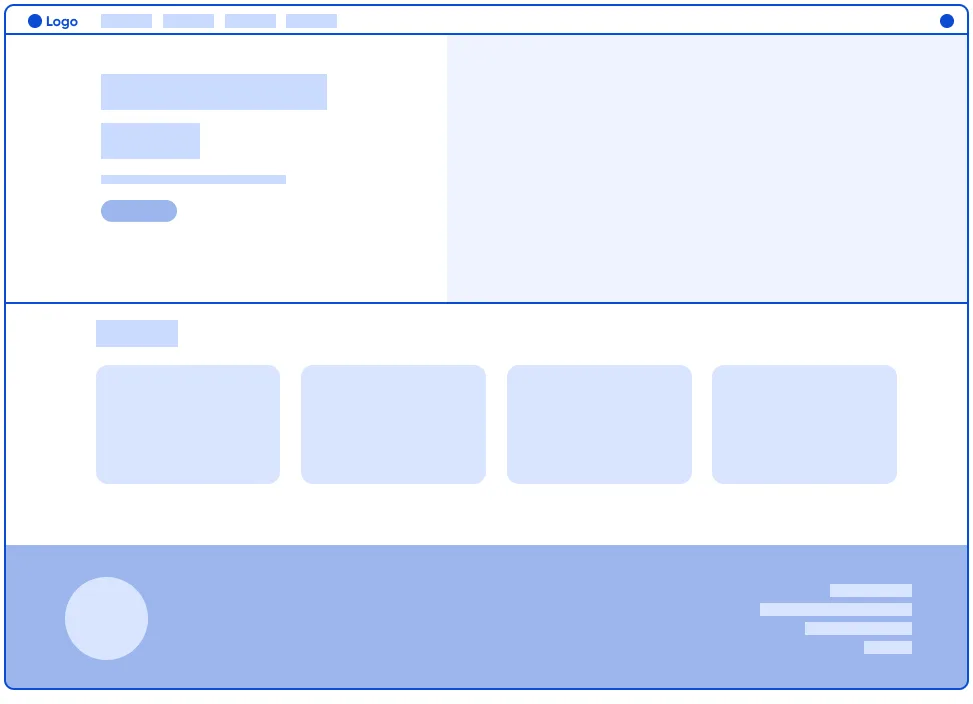
Low-fidelity wireframe of the Frontier home screen: blank hero, a row of four course placeholders, and a footer band
lo-fi
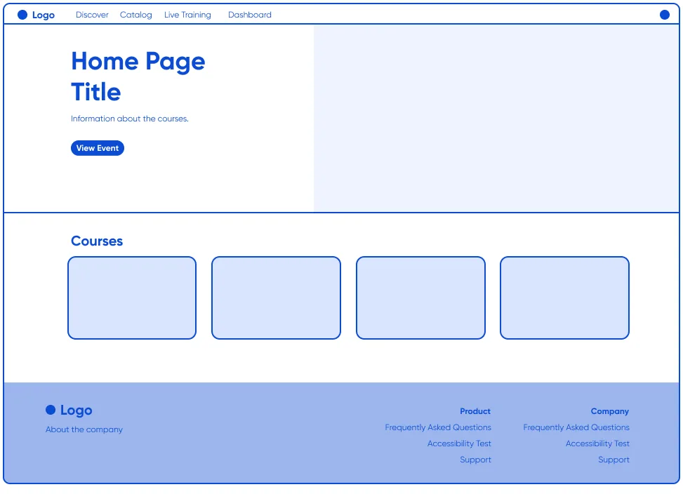
High-fidelity wireframe of the same Frontier home screen with real navigation, a titled hero, a labelled Courses row and a full footer
hi-fi

Low fidelity set the structure of every screen — a practical roadmap, no detail noise. High fidelity added the labels, refined the layout, and tuned the navigation, so the team could see the real thing before anyone built it.

Two futures, and the users picked one.

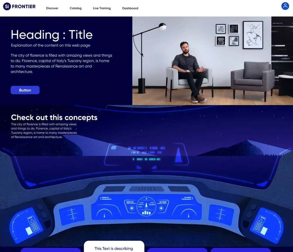
explored The explored futuristic space theme: a dark cockpit interface with glowing blue concept panels
theme A — futuristic space
chosen The chosen modern minimalist theme: a white page with photographic course cards and a clear concept row
theme B — modern minimalist, user-validated
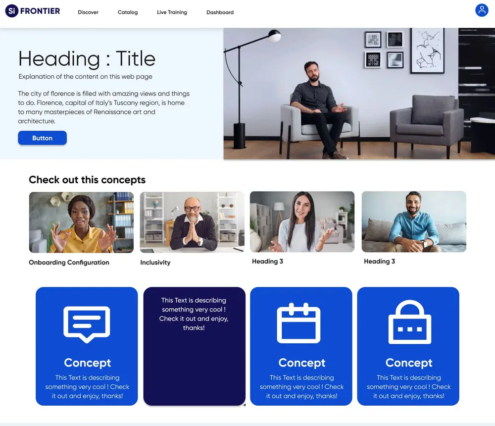
We explored a futuristic space theme against a modern minimalist one. Working with stakeholders and cross-functional teams, we followed the users rather than our own taste: minimalism resonated and matched the product goals, and the white background measurably improved the visual experience. The makeover took Siteimprove’s own colours with it, so accessibility and inclusivity live in the identity instead of being painted over it.
Phase 1

Discover — rebuilt from the ground up

This was more than a facelift: the old page was dated, inaccessible, and passive. Directing the product and content designers, I reconstructed it into an active, user-centric interface: continuous personalised suggestions, and feedback with something in it.
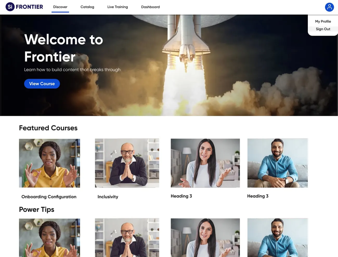
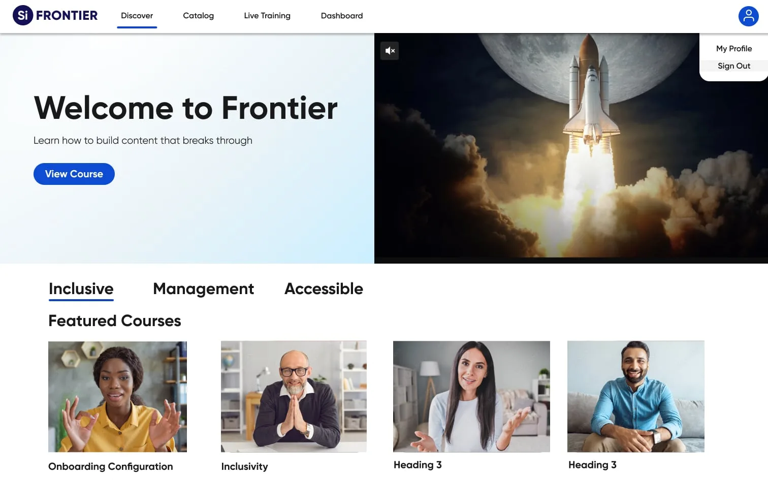
The redesigned Frontier Discover page: a light hero with a launch image, featured courses, power tips and an explore-all call to action
rebuilt — active, personalised, and built to modern standards
Phase 2

Courses — search and filters people can actually use

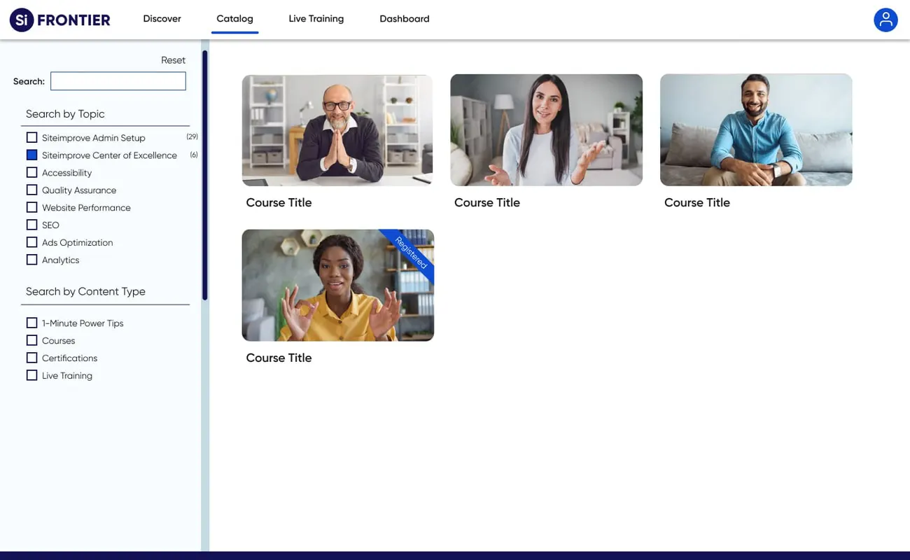
A cross-functional pass on search and filtering, with users, product and developers at the same table, aligned to WCAG 2.1. I streamlined the interface, made the filters intuitive, and kept the information below the overwhelm line.
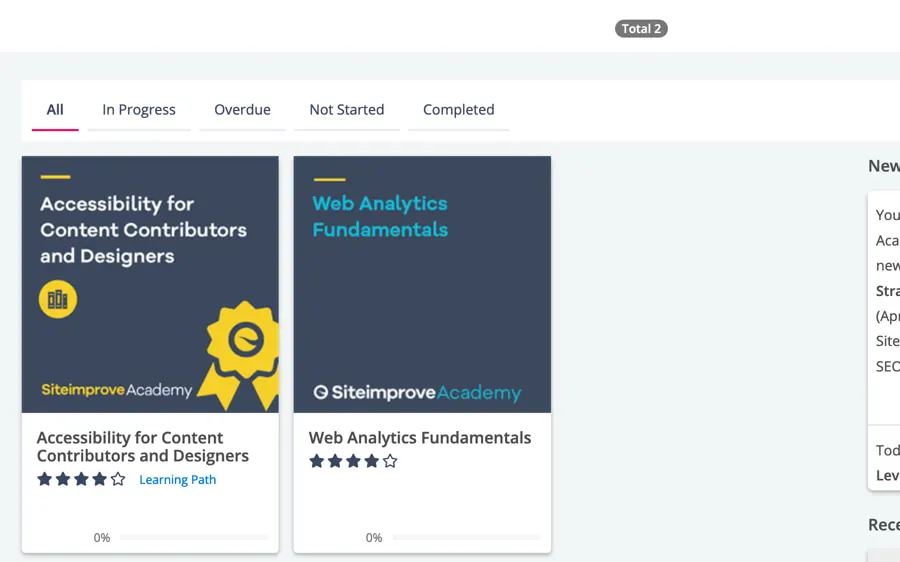
The old Siteimprove Academy course library: cramped tabs, dark course tiles with star ratings, and a news column
before — dated interface, no clear filters
The redesigned Frontier catalog: a search field, filters by topic and content type on the left, and photographic course cards
after — modern, accessible, and possible to navigate
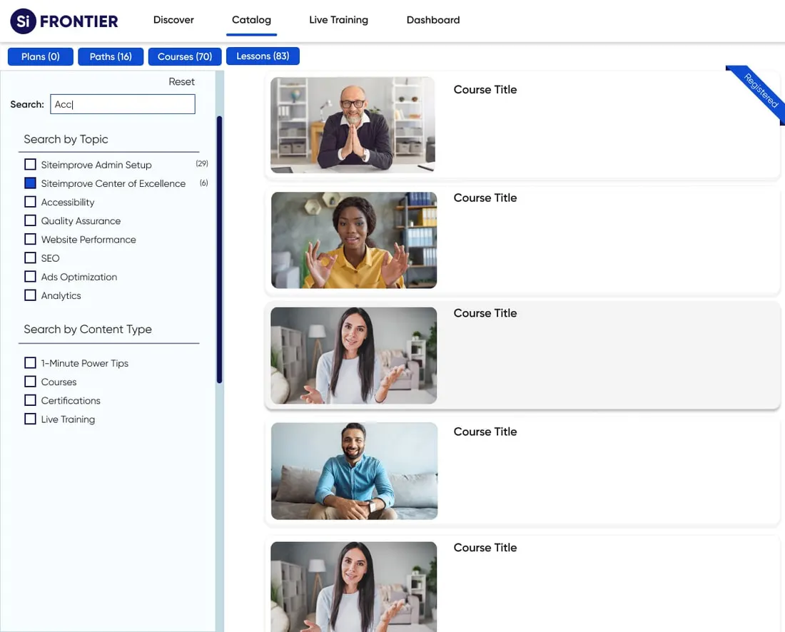
Frontier search results presented as a readable vertical list rather than a grid
search results — the cleaner, more digestible list view

The grid became a list because users said so. Courses and search results started in a grid; feedback called it overcrowded and overwhelming. The shift to a list brought readability, simpler navigation, and a more accessible result.

Phase 3

New ground — live event registration

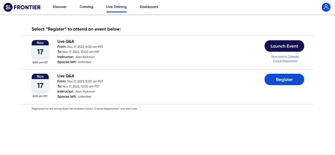
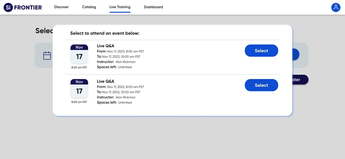
A flow that did not exist before: choose an event, weigh the details, confirm. Accessibility held throughout, and every round of user feedback went back into it.
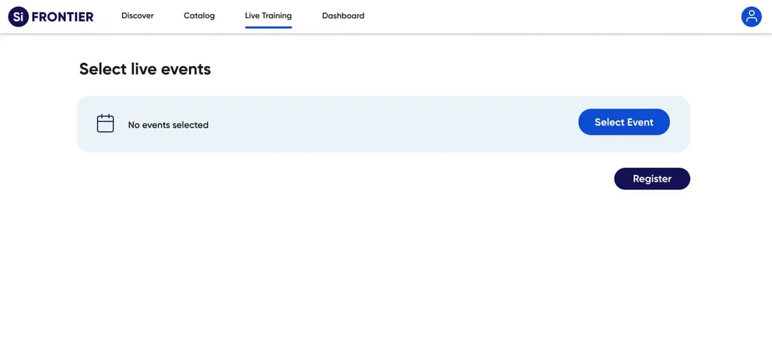
Step one of live event registration: a clean select-live-events screen with Select Event and Register actions
step 1 — a clean start to the registration
Step two: a dialog listing live events with dates, times, instructor and remaining spaces
step 2 — names, dates, and everything needed to choose
Step three: the confirmed registration with launch event, calendar invite and cancel options
step 3 — confirmation, calendar invite, or a way out
Phase 4

Personalization — goals, progress, and a profile worth opening

Goal tracking gave learners a live view of what they had in progress and what they had finished, and I redesigned the profile around a layout people could read. Both went through iterative rounds of user feedback.

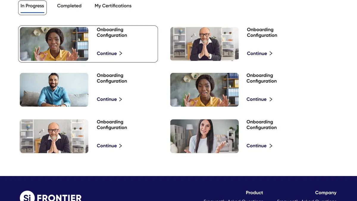
The Frontier dashboard showing in-progress courses with continue links, completed courses and certifications tabs
the dashboard — in progress, completed, certified
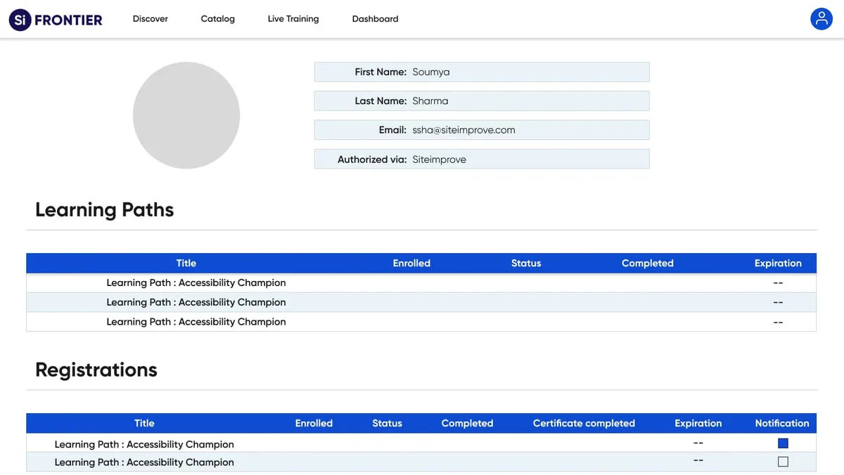
The redesigned Frontier profile page with account details, learning paths and registrations tables
the profile — statistics, learning paths, registrations

And then the course itself, not just the shell around it.

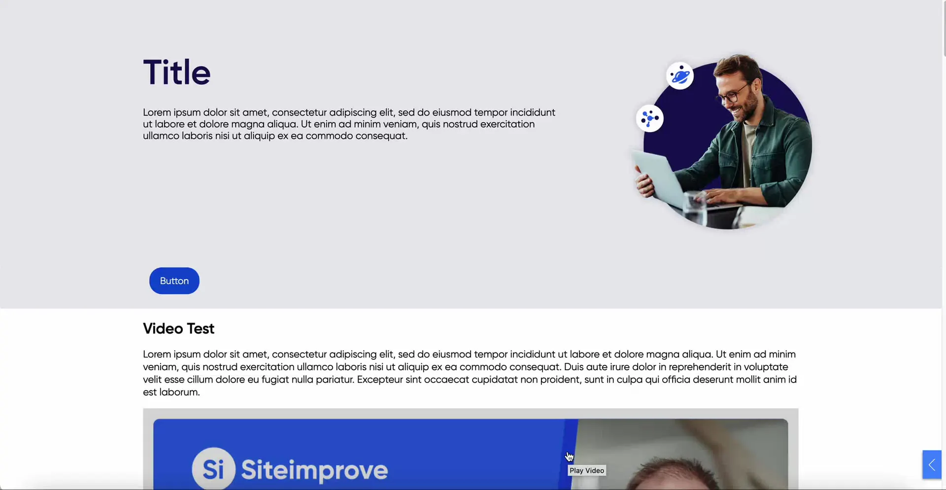
course layout — the template, and the activities that sit inside a chapter — 0:48
I designed and structured the course layout and the activities inside it — the video block with its transcript, the gallery, the accordions, the dialogue cards — so a chapter is something a learner works through rather than a page they scroll past.
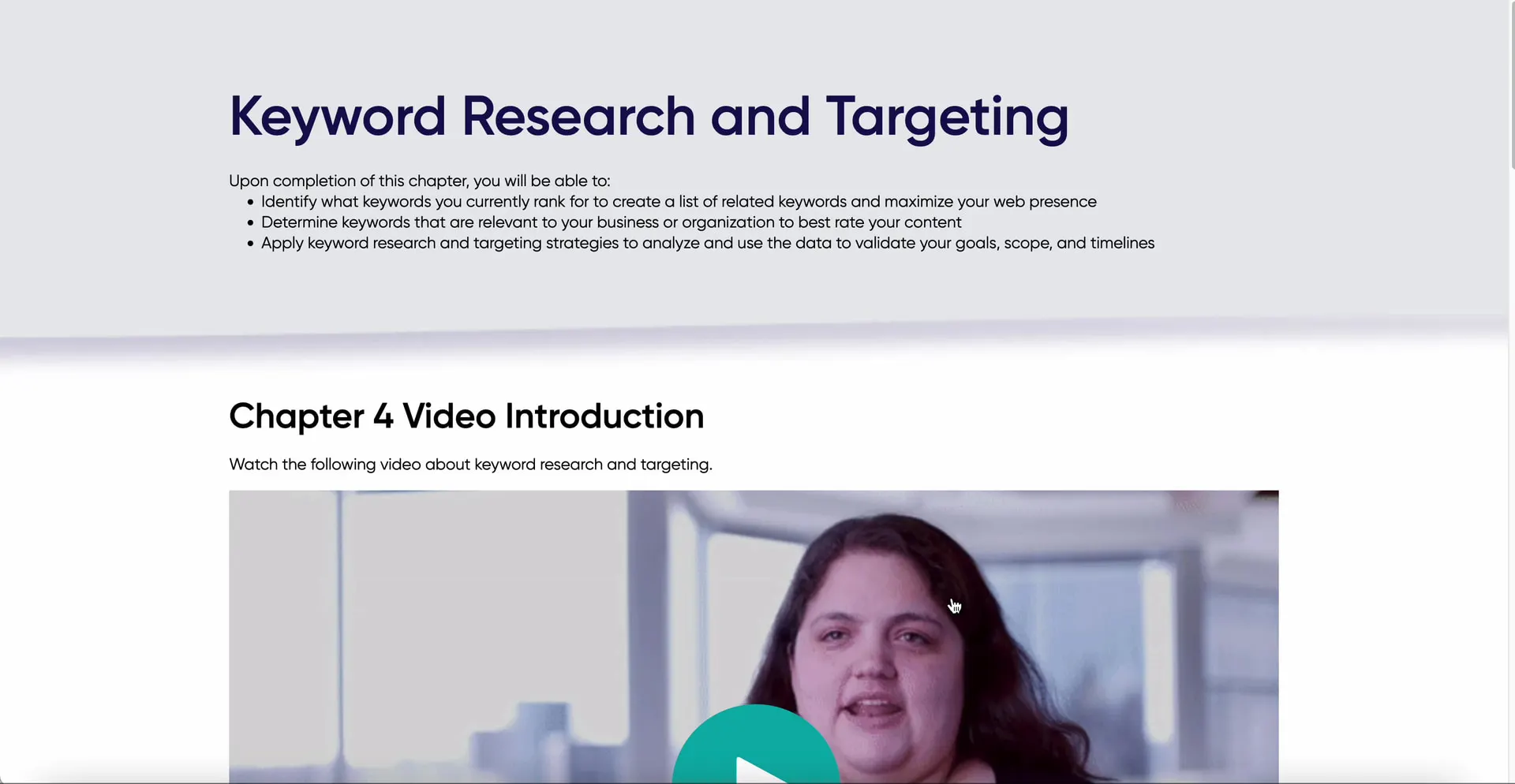
a published chapter — Keyword Research and Targeting, end to end — 0:23
The same treatment on real content: I tested every chapter for accuracy and added the quizzes and interactive elements that turn a lesson into practice.

I led the accessibility work, and we held it to the letter.

As leader of the accessibility team I spearheaded the implementation of WCAG 2.1, adhering to both AA and AAA content standards. The fine grain got the same attention as the framework: colour contrast tuned for visibility, focus states properly implemented on every button, and disabled states optimised rather than forgotten.

The component library is what made it hold. One set of decisions — type, colour, states, navigation — reused everywhere, so the standard survived every screen after it.

The colour codes every screen inherits.

the component library — colour

  • Text

    every word on the platform

    #191919
  • Button

    the primary action, and nothing else

    #0D4CD3
  • Disabled button

    still visible, plainly not available

    #141155
  • Background

    the field under everything

    #FFFFFF
  • Secondary

    the quiet surface, and one of the two divider tones

    #EAF3F7
  • Hover state menu

    the filter row the pointer is on

    #D3EBFF
  • Line dividers

    the rules inside a panel

    #CAD6DB
  • Side menu

    the filter panel's own field

    #F8FDFF

One set of decisions, reused everywhere. Contrast was tuned here rather than argued about per screen, which is what made the AA and AAA commitment survive the fortieth page.

The rest of the library, stated once.

the component library — type and buttons

  1. Type

    Gilroy, one family

    • H1, H2 and H3 for headings
    • B1 and B2 for body
  2. Button

    one button, four states

    • Active — the filled blue button
    • Disabled — the same shape, in the disabled blue
    • Hover — the fill a step darker
    • Focus — the fill held, a ring outside it
  3. Navigation

    three places a person can be

    • Top navigation — Discover, Catalog, Live Training, Dashboard, account
    • Side navigation — search by topic, then by content type
    • Course navigation — chapters, and where you stopped inside them

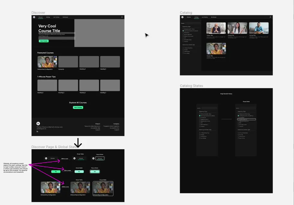
Every state designed, including the ones people only reach by keyboard.

the interaction specification — element, states, timing

  1. Discover

    top-navigation link

    • Default — the label, no rule under it
    • Hover — a blue underline arrives
    • Focus — a navy ring around the link, underline held
    • 250ms ease between states
  2. Go

    primary button

    • Default — the blue button
    • Hover — the same button, a step darker
    • Focus — a navy ring outside the button
    • 250ms ease between states
  3. Onboarding Configuration

    course card

    • Default — the thumbnail and its title
    • Hover — the thumbnail dims
    • Focus — one rounded navy ring around card and title together
    • 300ms ease between states

The focus state is the one that gets skipped, so it was specified first: the same ring, the same timing, on a link, a button and a card. The keyboard gets the designed product, not the leftovers.
The notes the developers built from.

accessibility annotations — states, timings and semantics, marked up on the designs themselves — 1:59
Two minutes across the annotated board. Every state has its timing written beside it, every transition is told to respect prefers-reduced-motion, and the structure is specified as well as the look: which line is the h1, which titles are a list, and which item carries aria-current for the chapter you are in.

And then it was just a good product.

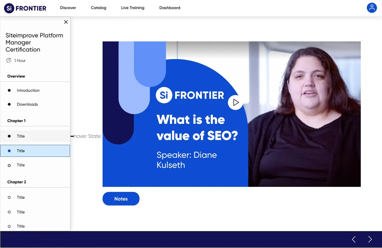
A Frontier course page playing a video lesson titled What is the value of SEO, with the chapter list on the left
the course player
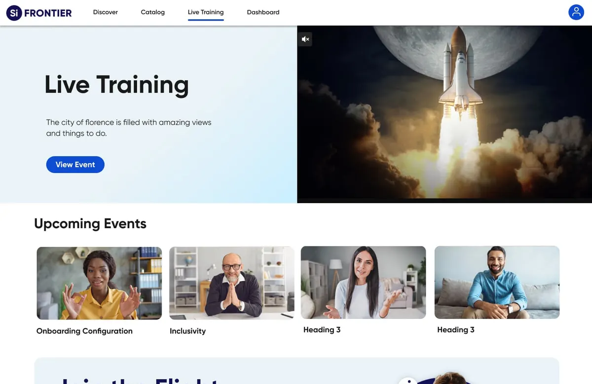
The Frontier live training page with a hero, upcoming events row, and a community invitation band
live training
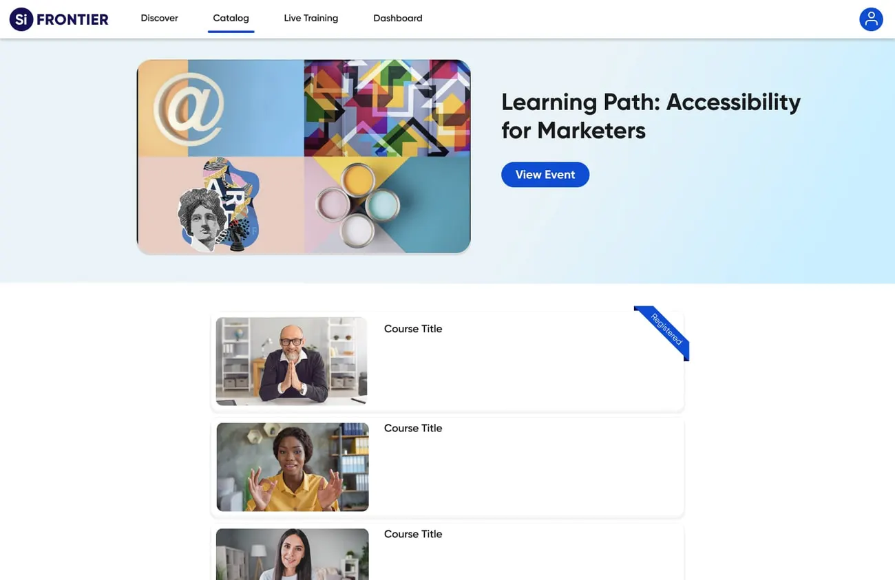
A Frontier learning path page for Accessibility for Marketers with its course list
a learning path
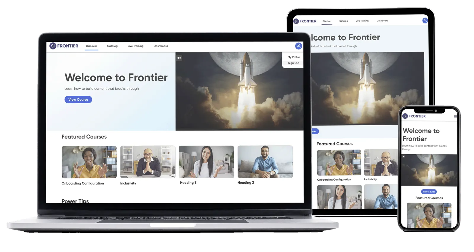
Frontier shown on a laptop, a tablet and a phone, each carrying the same layout and design system
the same system, on whatever they opened it with
Optimising for varied devices and screen sizes was one of the hardest constraints on the project. The design system is what let one platform travel across all of them without losing the standard.

04 Outcomes

Sixty-one days later, it was in production.

It launched clean and branded, with content people could find and a login that got out of the way. Then the usage arrived.

61 92

days to production / full launch

Production launch 11/7/2022 · full launch 2/3/2023. We hit the ground running on course and site curation, upleveled the site with proserve so the brand experience was strong from day one, and identified and prioritised the technical need that mattered most: SSO.

shipped at launch

  • 2 domains launched
  • 78 courses published

usage from launch day

  • 2.20k domain-registered students
  • 1.11k active students
  • 3.68k course registrations
  • 812 course completions
  • 651 total session hours

And this is it, running.

the launched platform — Discover, the catalog and its filters, a learning path, the community — 1:14
A screen recording of the live platform after launch — real courses, real filters, real registrations — not a prototype. Click to play; nothing on this site starts by itself.

05 Reception

Learners posted about it publicly.

Two of their posts are reproduced here as they wrote them.

Great start to a Sunday morning! The new interactive course from Siteimprove provides great levels of exposure and in-depth knowledge to all features of the tool.
Kiran Kumar Buthpur CMS Strategy & Governance · LinkedIn post
Reviewing the basics and learning something new with Deque University.
Lisa Blinn Digital accessibility specialist · LinkedIn post

Kiran completed the Platform Manager Certification, issued by Dave Zinsman, Director of Customer Education, valid January 8, 2023 to January 8, 2024. Lisa’s certificate — Accessibility Fundamentals for the Web and Siteimprove Analytics — is dated October 13, 2022.

06 Reflection

What the work taught me.

Thoughtful design moves engagement further than I expected it to.

Balancing aesthetics against function across every screen size sharpened how I make trade-offs. Holding inclusivity for every user — including users with disabilities — turned accessibility into a design material for me rather than a checklist at the end. Tight deadlines and a fixed budget taught me project management the hard way, and keeping pace with where the web was going kept the toolkit honest.

The lesson I kept: user-centred decisions, features people actually want, and accessibility standards are what turn a redesign into engagement. A platform 2.20k people registered on, and 812 finished something on, is the proof.

  • varied devices and screen sizes
  • accessible and inclusive for every user
  • aesthetics balanced against usability
  • deadlines met, budget held
  • keeping pace with the web

A company that sells accessibility now teaches on a platform that practises it.