Visual Design · Graphic Design
Home Road Films
Infographic film frames for a production house and its clients.
Home Road Films is a production house making infographic video for clients across industries. I designed frames — the ones that have to carry an idea in the two seconds before the next cut.

- Role
- Visual Designer, Storyboard Artist
- Toolkit
- Figma, Photoshop, Illustrator, After Effects
- Team
- Soumya Sharma, Amrit Verma
- Duration
- May 2019 – Aug 2019
01 The studio
Script, board, frame, animate. I worked the middle two.
At Home Road the team writes the script together, and the script becomes a storyboard before anybody opens a design file.
The graphics are then built from that board, frame by frame, and the finished frames are handed on to be animated. It is a pipeline with no room for a beautiful picture that does not say the line underneath it.
I boarded and I drew. Over one summer that meant two very different films for two very different clients — one that had to feel like magic, and one that had to explain a machine.
- Script
- Storyboard
- Graphics
- Animation
02 Sumitomo
Sumitomo Brand Animation — magic, built out of light.
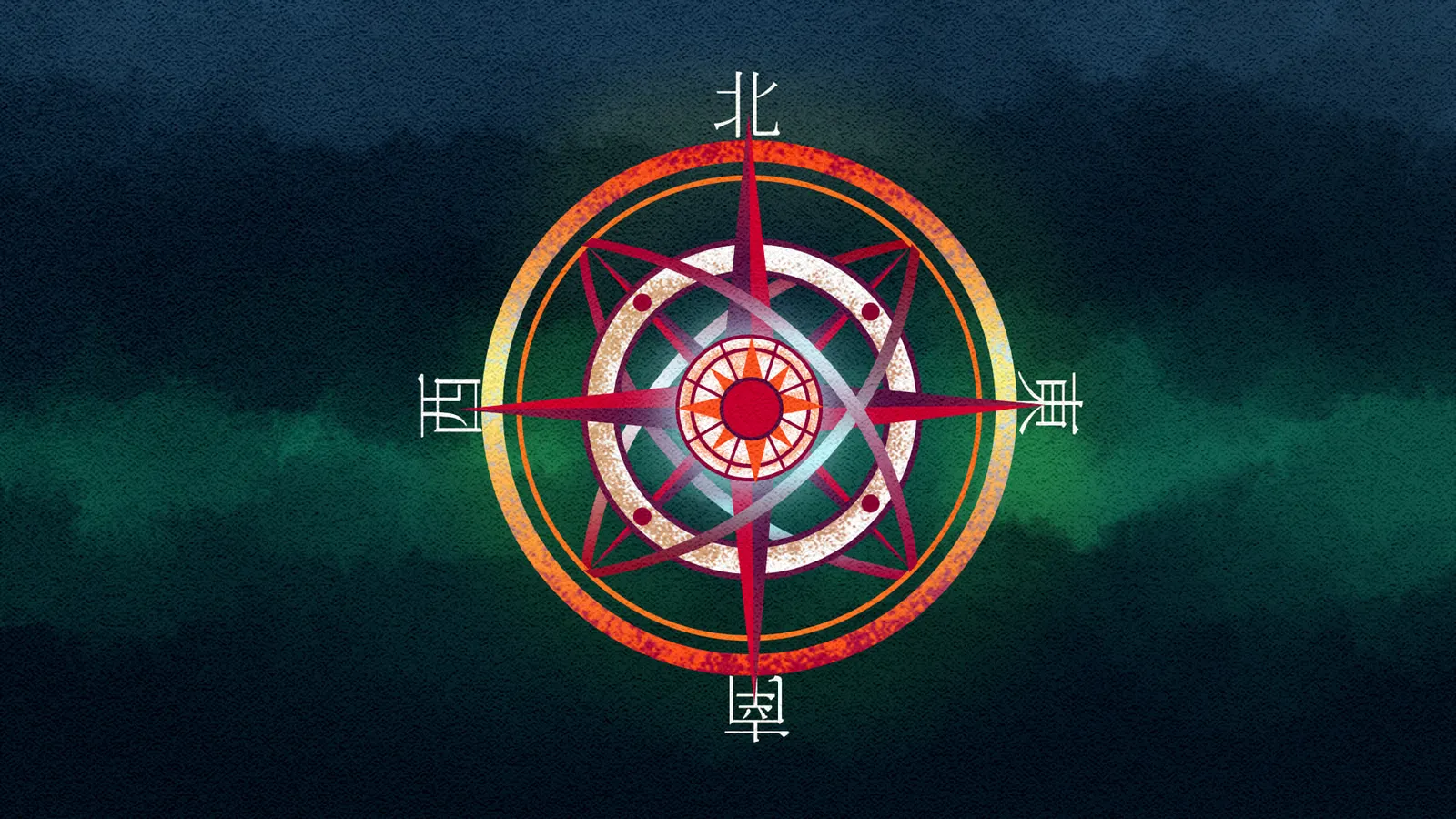
The client wanted a video that felt magical and read as unmistakably Japanese, and wanted it to never appear to cut.
I got the magic by putting a glow on a few chosen elements in every frame rather than on all of them, which is also why the palette runs dark and bright at once: the deep field is there so the lit thing has somewhere to be lit against.
They asked for a lot of Japanese elements, and for the frames to flow smoothly into one another, so we designed for an unbreakable flow, where each frame hands its shape to the next one instead of ending.
The film, in pencil first
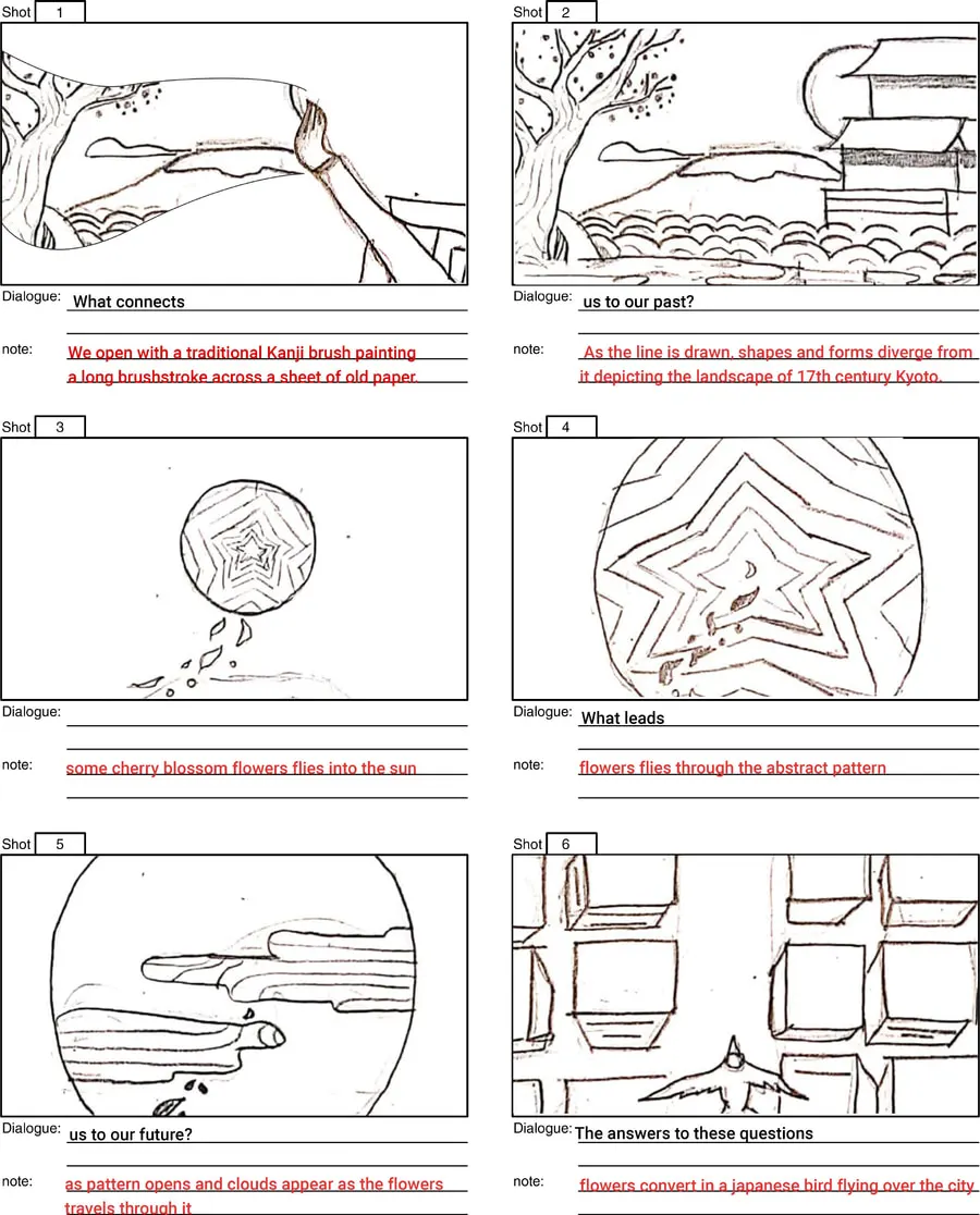
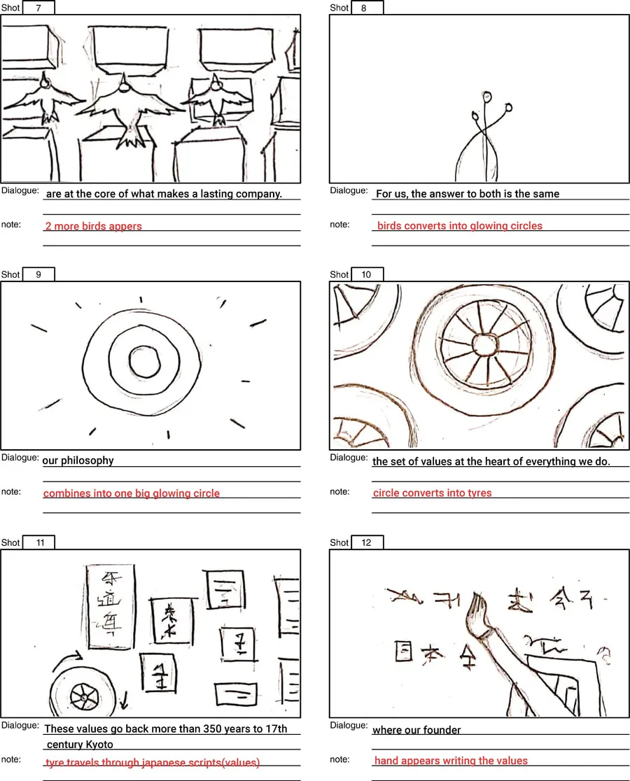
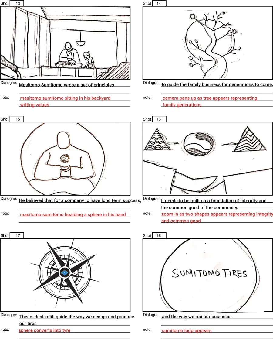
Eighteen shots, and the film never once cuts.
This is what is written under the pencil, set in type so it can be read: the spoken line first, then the thing that has to happen on screen. Six shots to a sheet, in the order the sheets are shown above. Read the action notes on their own and the rule of the film is visible — every one of them turns the last shape into the next one.
The finished film is not published here — the storyboards and the frames are what I hold.
- 01
“What connects”
Open on a traditional Kanji brush painting — one long brushstroke on old paper.
- 02
“us to our past?”
Shapes diverge from the line, depicting 17th-century Kyoto.
- 03
(a beat, no line)
Cherry-blossom flowers fly into the sun.
- 04
“What leads”
The flowers fly through the abstract pattern.
- 05
“us to our future?”
The pattern opens, and clouds appear as the flowers travel through.
- 06
“The answers to these questions”
The flowers become a Japanese bird, flying over the city.
- 07
“are at the core of what makes a lasting company.”
Two more birds appear.
- 08
“For us, the answer to both is the same”
The birds become glowing circles.
- 09
“our philosophy”
They combine into one big glowing circle.
- 10
“the set of values at the heart of everything we do.”
The circle becomes tyres.
- 11
“These values go back more than 350 years to 17th century Kyoto”
A tyre travels through Japanese script — the values themselves.
- 12
“where our founder”
A hand appears, writing the values.
- 13
“Masatomo Sumitomo wrote a set of principles”
He sits in his backyard, writing.
- 14
“to guide the family business for generations to come.”
The camera pans up and a tree appears, for the generations of the family.
- 15
“He believed that for a company to have long term success,”
He holds a sphere.
- 16
“it needs to be built on a foundation of integrity and the common good of the community.”
Zoom in: two shapes, one for integrity and one for the common good.
- 17
“These ideals still guide the way we design and produce our tires”
The sphere becomes a tyre.
- 18
“and the way we run our business.”
The Sumitomo logo appears.
Frames
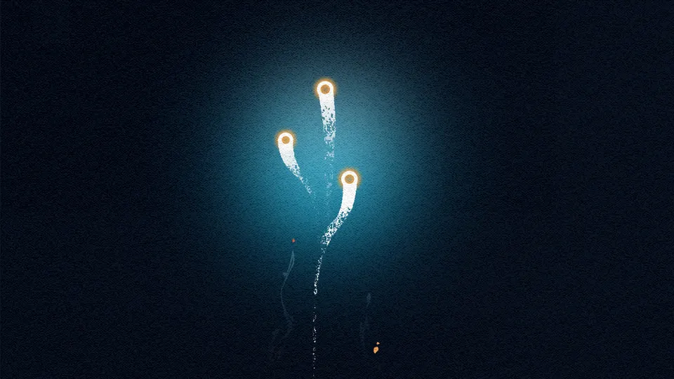
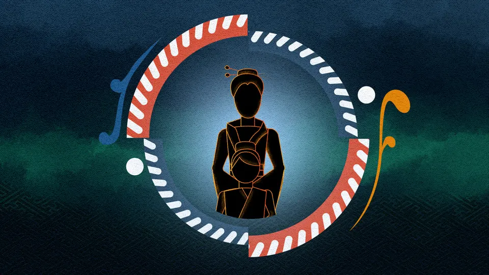

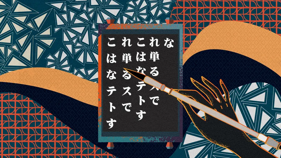
Nothing in this film is allowed to end. Each frame hands its shape to the next one — a circle becomes a tyre, a bird becomes a light.
03 Zivelo
Zivelo — the opposite job, where the queue was the story.
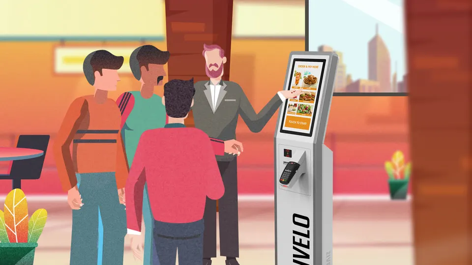
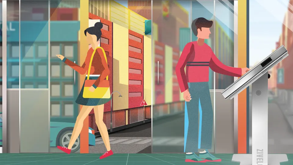
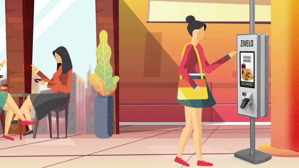
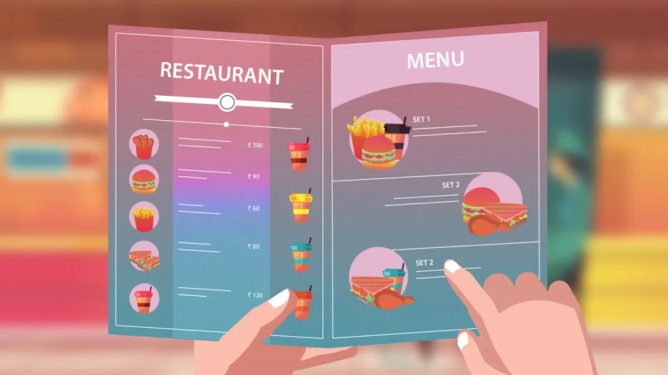
The job was an informative film: how to use the product properly, and why using it is worth it.
Here the constraint was the client's own brand colours, so the palette was decided before I started and the work was all staging. I built situations instead of diagrams: people waiting in line to order their food, and then the same street with the line gone.
Every character in these frames is one I drew and rigged, which is what makes the comparison land: the queue and the empty pavement are populated by the same people.
Frames
One summer, two films, and the same lesson twice.
Sumitomo taught me that a frame can carry a feeling; Zivelo taught me that a frame can carry an instruction. Both only work if the idea is legible in the first moment it is on screen, which is the discipline I have used on every interface I have designed since.