Roast
type, icons, and the only near-black on screen
#2D2D2DUI/UX Design · Product Design
A coffee-shop app built around the one thing people actually want: their order, their way.
Ordering coffee on a phone is a customization problem pretending to be a menu problem. I designed for the customizing and let the menu get out of its way.
01 The brief
Bean & Beyond wanted the whole ordering experience to happen before anybody reaches the counter.
The task was an interface that makes ordering coffee simple enough that people do it twice.
Bean & Beyond was introducing a mobile app for its customers: explore the menu, customise the order, and satisfy the craving without queuing for it. The project was the UI and the UX of that app: intuitive, good-looking, and built for the way people actually hold a phone.
Five things had to be true on a screen that small.
An interface designed for the needs of somebody on a phone, with the menu organised where research says people go looking for it.
Browse, customise and complete a transaction with as little friction as the screen size allows.
WCAG 2.0 and mobile-specific best practice, so the app is navigable and operable by gesture, voice or screen reader.
High-resolution imagery and short descriptions, with swipeable sections and touch-to-expand carrying the browsing.
Touch-first controls — sliders, buttons and gestures — so personalising a drink is quick rather than a form.
02 Research
The survey opened with demographics and closed with how people imagined paying.
I wanted the whole order described back to me before I drew any of it.
Respondents were asked to picture their path through the app from start to finish and tell me what they expected from the navigation, from the customisation options, and from the payment. To get at the visual side I put hypothetical design elements, colour schemes and font styles in front of them and asked which ones matched the way they think about buying coffee.
The last section was the cart: how they imagined adding items, changing an order, and completing a transaction without friction. That is the part of an ordering app that quietly decides whether anybody opens it a second time.
three incumbents, ten features
| Feature | Starbucks app | Panera app | Dunkin' app |
|---|---|---|---|
| Personalization | Yes | Yes | Yes |
| Navigation | Yes | Yes | Yes |
| Intuitiveness | Yes | Yes | Yes |
| Accessibility | Yes | Yes | Yes |
| Visual Appeal | Yes | Yes | Yes |
| Gamification | Yes | Yes | No the only gap in the set |
| Cart Management | Yes | Yes | Yes |
| Feedback Mechanisms | Yes | Yes | Yes |
| Quick Ordering | Yes | Yes | Yes |
| Search Functionality | Yes | Yes | Yes |
Scroll the table sideways for every column
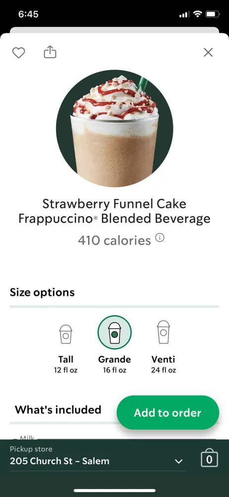
Starbucks and Panera have both landed on minimalist designs that put navigation and personalisation first. Dunkin' is easy to use and still has room in places. The analysis gave me the best practice to adopt and, more usefully, the openings: gamification and cart management.
The incumbents had already solved looking good. What was left was the cart.
03 The design
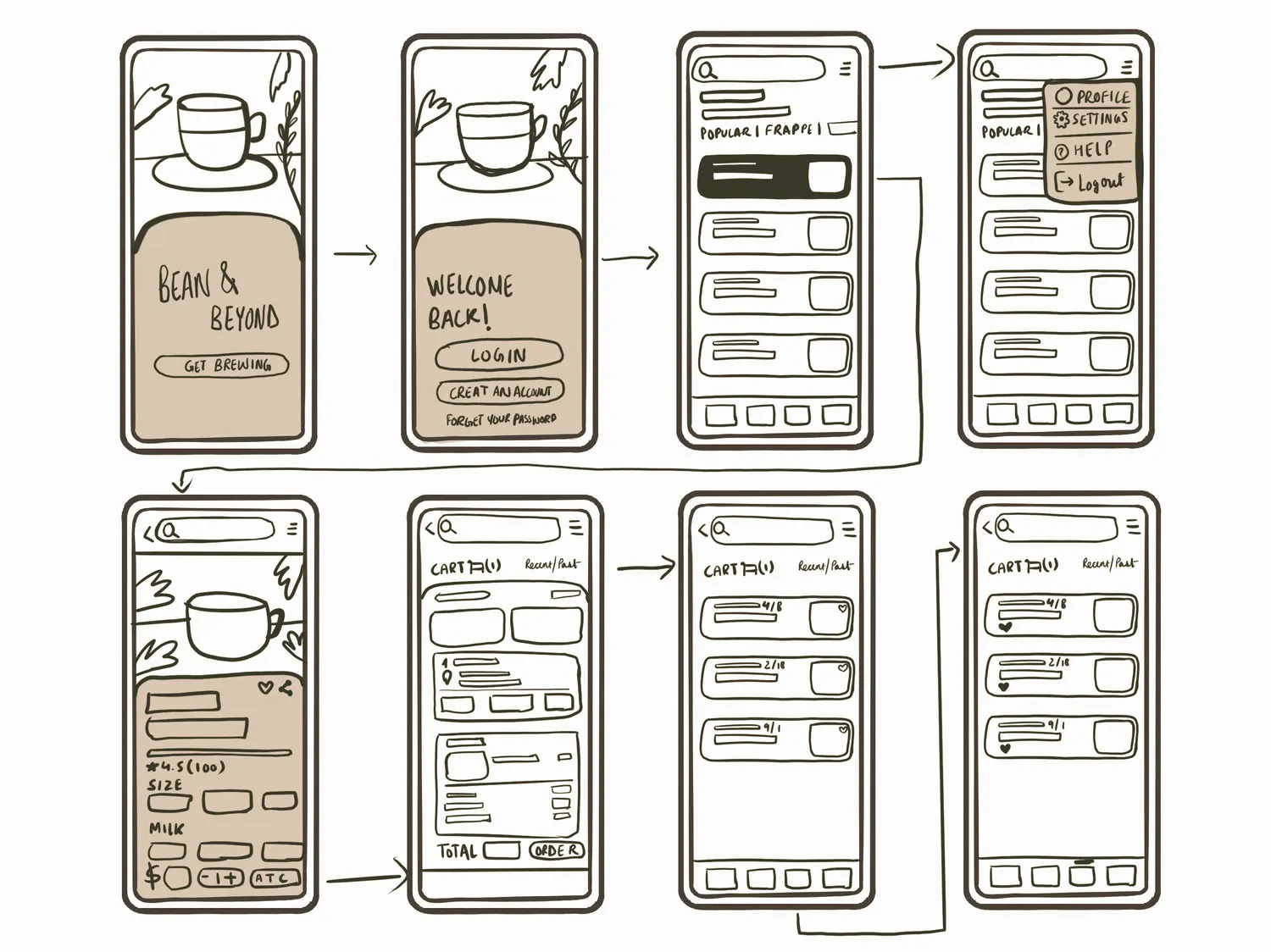
The flow first, then the sketch, then the system, and only then the screens.
opening page to checkout — and everything that loops back
Opening page log in, or create an account
Everything after the first order loops. Past orders feed frequent orders, frequent orders feed favourites, and favourites put the second coffee two taps from the home screen. The profile hangs off the end of that loop rather than the front, because nobody opens a coffee app to manage an account.
the four-colour core
type, icons, and the only near-black on screen
#2D2D2Dthe one warm accent — it only ever means do this next
#EB916Bcards, the tab bar, every quiet surface
#FFF5E9the field the drink photography sits on
#FFFFFFI found the palette in coffee's own comforting colours — mocha and cream — and paired them with a clean modern face so the menu stays readable at arm's length. Warm enough to read as the brand, plain enough that the drink photography is the loudest thing on the screen. Accessibility and inclusivity were inputs to the palette, not a pass at the end of it.
And the parts that had to behave the same everywhere.
Three button states, one type ramp, and a tab bar that stays at four. Poppins throughout — regular 16 for body, medium 16 on the drink menu, medium 14 in buttons.
The tab bar is drawn once and used on every screen: four icons on the steamed-milk surface — home, cart, favourites, account — with a crema marker above whichever one you are on.
The disabled state is the one people forget, so it is specified here rather than decided later by whoever builds it.
The crema pill, #EB916B — the one warm accent, and it only ever means do this next.
The same pill a step deeper, #DF784D, for as long as a thumb is on it.
The pill drops to a flat grey, #E9E9E9, and the label goes grey with it — still there, plainly not available.
04 Final screens
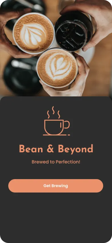
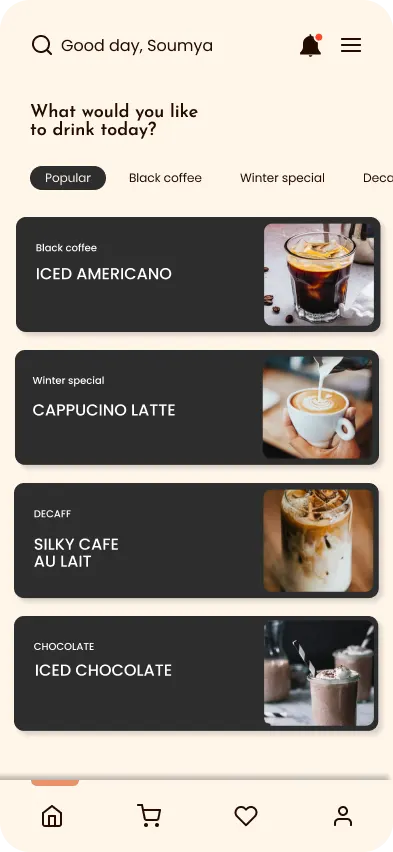
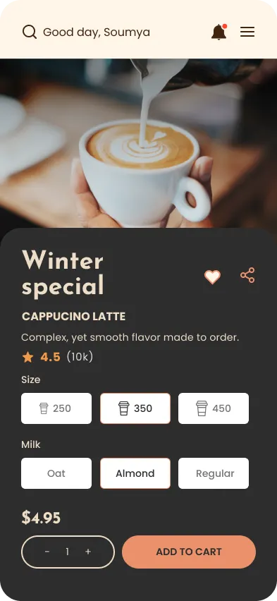
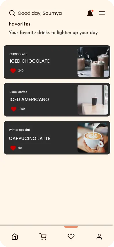
Four screens carry the whole product: the invitation, the menu, the drink, and the reason to come back.
Everything the research asked for ended up on one of these four screens.
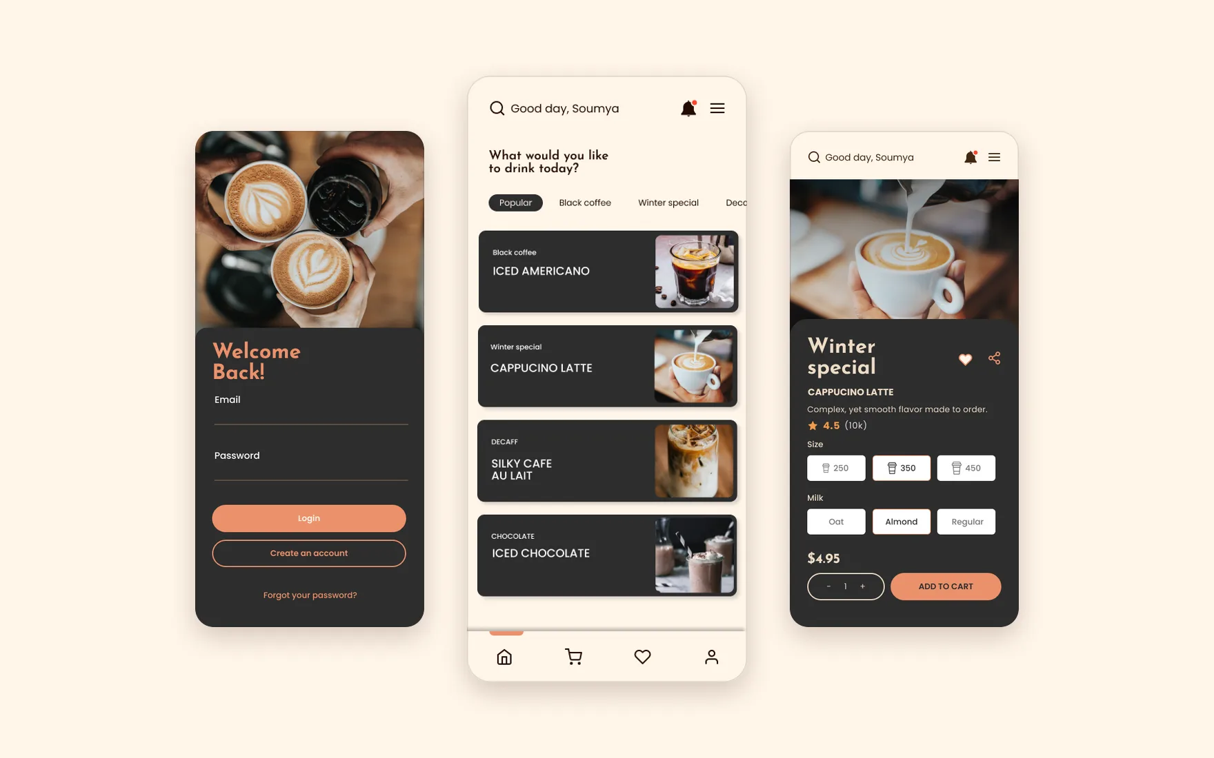
The menu leads with photography and short labels because that is how people choose a drink. The drink screen gives customisation the full width — size, milk, quantity and price all visible at once, with the primary action pinned where a thumb already is. Favourites exist so the second order costs almost nothing to place.
The tab bar stays to four destinations. On a screen this size, a fifth is a decision nobody wanted to make.
05 Testing
I recruited a diverse group from the app's own audience and ran usability tests on the same screen designed more than one way.
Rather than ask people what they thought of a design, I asked them to choose between designs.
I selected participants who represented the app's audience and put variations of the same screen in front of them — interact with each one, then tell me which reads better for usability, for clarity, and for how much you want to use it. Preference questions get honest answers in a way that opinion questions don't.
The cart got two versions and the home screen got three, each laying the offering out differently. What came back gave me a decision I could make with data instead of taste.
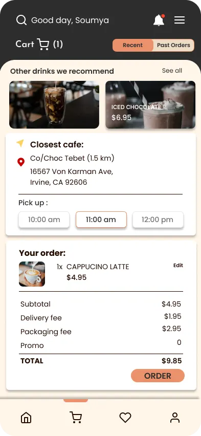
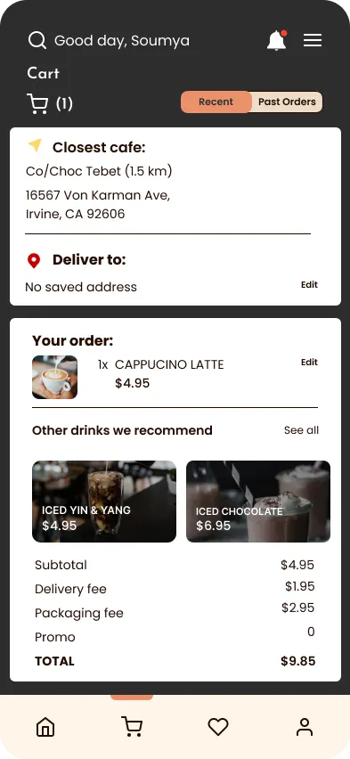
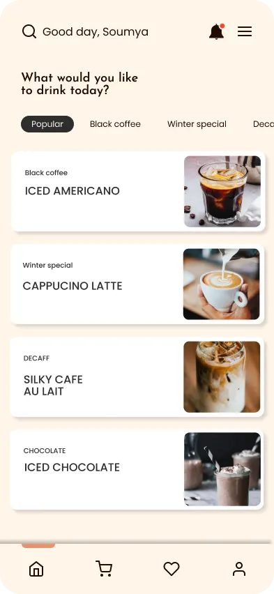
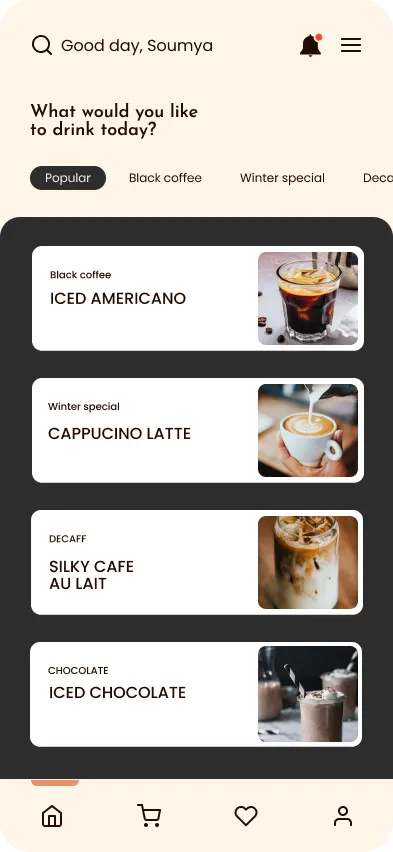
I love how easy it is to order my coffee using this app's stylish design.
Thanks to personalized recommendations, I've discovered new coffee favorites!
I truly appreciate the inclusivity of this app; it makes my coffee runs hassle-free.
Every morning, I rely on the quick ordering feature of this app to kickstart my day.
Four reviews, reproduced word for word.
06 Reflection
The balance between how a thing looks and how it works is not a compromise you strike once.
Every hard problem on this project was a version of the same one. The interface had to adapt across screen sizes and orientations without losing usability, and be inclusive in practice rather than technically compliant. Visual appeal couldn't be allowed to quietly cost somebody a task. Research findings, not my preferences, decided the design, and the trends worth adopting got in while the rest stayed out.
Turning an idea into a finished app taught me as much about managing time and budget as it did about interfaces, and it settled something for me about how much a thoughtful screen is worth to the person on the other side of it.
The design work people notice is the menu. The design work they feel is the cart.