Party Person
pubs, clubs, live bands, somewhere good to eat after
#F42254UI/UX Design · Product Design
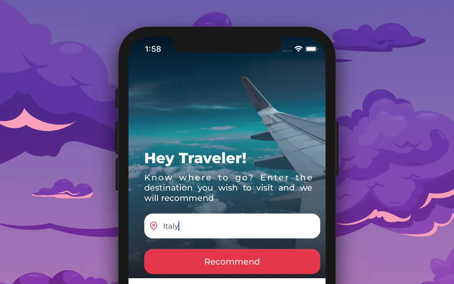
An AI travel companion that matches places to how you actually travel.
There are more places to visit in a new city than anyone can sort through, and the person who wants a quiet morning gallery is handed the same list as the person who wants the loudest bar. Hodo learns which one you are first.
01 The problem
Solo travellers arriving somewhere new, who want a place worth going to and don't have the days it takes to find one.
Everybody gets handed the same city.
There are plenty of blogs and reviews about anywhere worth visiting, and plenty of them are misleading, biased, or simply written for somebody else. Sorting the useful ones out takes research time that people travelling for a week don't have, so they do the safe thing and go where the city is already famous for going.
Somebody who likes to party can't work out which pub in a new city is the right pub. Somebody who wants a quiet morning is handed exactly the same list. That was the challenge: to say anything useful, the app had to know something about the person first, and it had to have real places to say it about.
Collect the right information from users to help them discover their own travel personality.
Make a simple place recommendation based on what actually interests them.
Give travellers a wish list, so a place they like now survives until the trip.
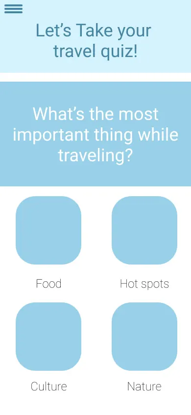
A recommendation is only as good as the question it starts from. Ours started with a personality quiz.
02 Research
Interviews and surveys came first, then an impact-versus-effort graph, so the first build contained only what was worth building.
The question board was a map of everything we didn't know yet.
The interviews ran from how somebody spends a free weekend to how they'd plan a trip on somebody else's behalf. They gave us the problems and the requirements in the participants' own words, and those answers set every decision that followed.
Plotting each feature on an impact-versus-effort graph turned all of it into a build order: we could see what a feature was worth against what it would cost us in time, and put only the highest-value ones into the first round of user testing.
every question we went in with, grouped by what it was trying to learn
asked of every traveller
follow-ups, asked when an answer opened a door
asked of the travel agents
a planner's day, step by step
The probes were the ones that turned out to matter: how people decide where to go, whether they trust what a search engine tells them, and what a good trip felt like the last time they had one.
I am lazy to find a good place to visit during weekends
I would love to explore a new place in my city
Two of them are kept exactly as they said them. The first one is the product: the effort is the problem, not the appetite.
six reasons, from the first round of interviews
Travel the word at the centre of the board, and the six things it branched into
People try new things that they are not familiar with.
Some people travel to a new city, where work takes them.
People travel to learn new skills and different cultures, which include history and food.
Many like to find places on this planet that are secluded.
A lot of people want to get away from their regular life.
People also bond with family and friends.
There are a lot of reasons to go somewhere new, and no two travellers rank them the same way. Grouping the ones that behave alike is what made the data collectable, and it is also what kept the categories broad enough that nobody falls outside them.
Five travel personalities, not twelve.
We combined the personalities that behaved similarly, which did two things at once: it made the dataset possible to collect, and it kept the categories inclusive enough that a real person recognises themselves in one of them rather than being sorted into a box.
Art, history and the facts behind both — festivals, museums, fairs, theatre, old forts and castles, and the local spots where a place keeps its heritage.
Walking over driving. Hikes, treks, trails and adventure sports, up early, out all day, and comfortable choosing adventure over comfort.
A bit of everything: art and history, the city's culture, food and nightlife, pubs and clubs, adventure spots and hikes, and shopping.
The family vacationer — time with the people they came with, hotels and activities that actually relax them, sightseeing worth a photograph, and their own pace.
Dressed up and out late — the pubs, clubs and nightlife, wineries and breweries in the daytime, live bands and concerts, and somewhere good to eat after.
the two personas the interviews produced
I love travelling! I wish I had an assistant to plan my trip as per my preference.
Carla is a mom of two little kids. She is very ambitious and loves to stay fit and healthy. Her husband and her try to organise 2 family trips per year. They love spending time together, traveling, exploring new places and doing family-friendly activities. They are willing to spend more on activities and experience.
I just want to have a reliable recommendation system.
Andrew is a single young adult who likes to travel to different cities and explore the new places. He loves nature and likes to do a lot of adventure sports in his free time. He is a very busy man, does not have any time to plan his own trips, and he doesn't rely on the internet for the right information.
Carla plans two family trips a year and resents every hour of the research. Andrew wants the hidden trail, and doesn't trust the internet to find it. Different lives, same complaint: the planning costs more than the trip is worth. Both of them would take a recommendation over a search result, provided the recommendation knew anything about them.
03 The design
The first version explained itself constantly. Every iteration after that took something out.
second iteration — after the faults in the first one showed up in testing
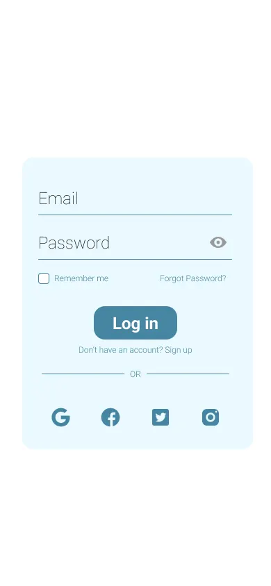
Hodo onboarding, then sign up or log straight in
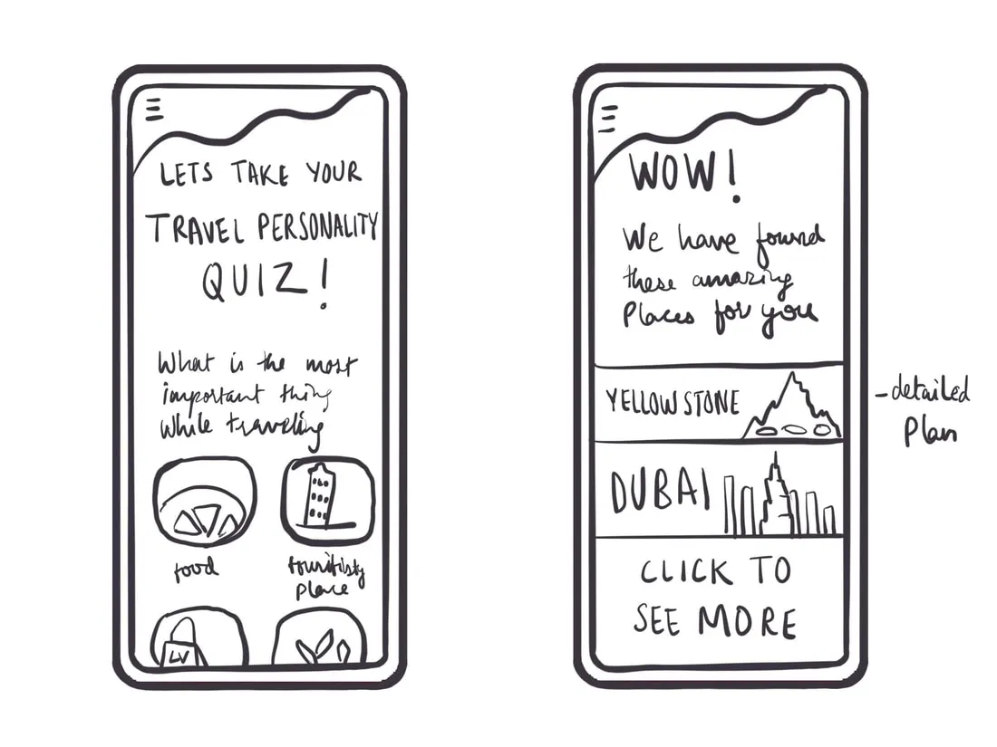
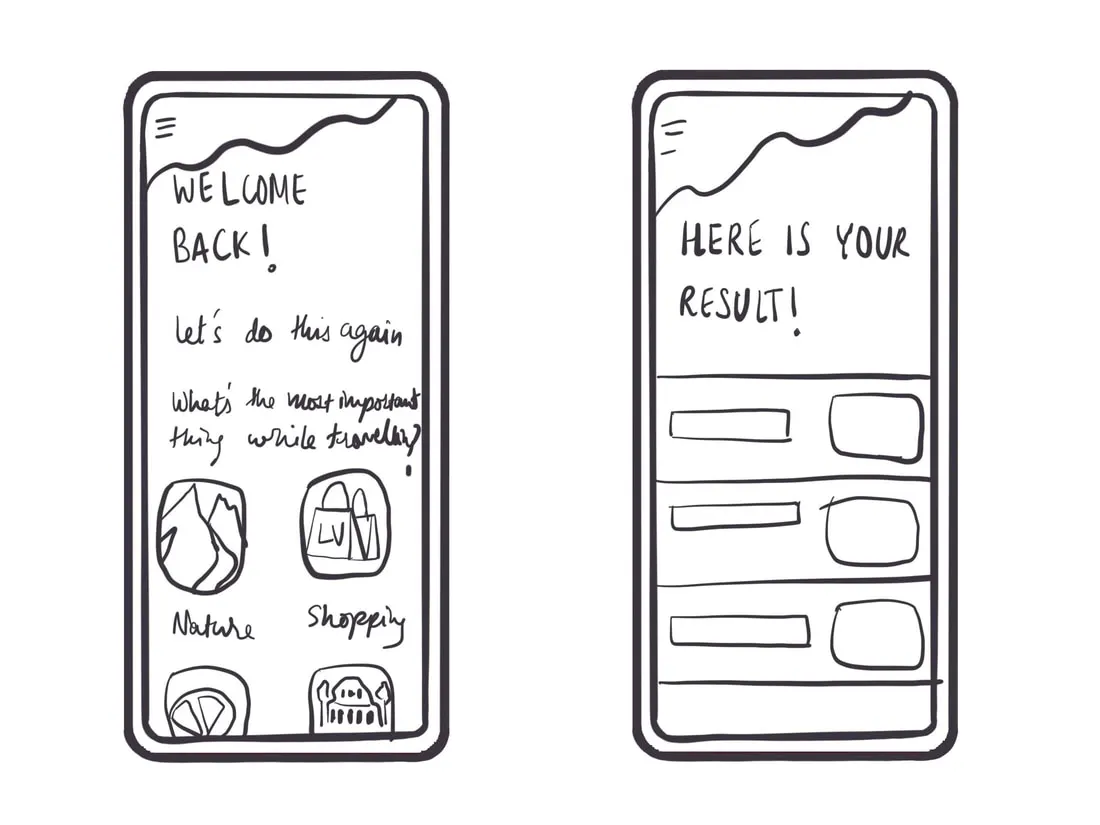
This is the second flow, not the first. Testing found faults in the plan my own trip branch, so we simplified and deliberately reduced the number of affordances in the app; after the second round we changed the flow again and added the detail about each location in the dataset, which is what gave people a reason to stay on a screen. The most ambitious idea died here too: the first design sent travellers straight from the quiz to a screen of recommended places, the way Netflix suggests films. The AI model behind it would have taken far longer to produce results in that shape than we had.
the personality colour system
pubs, clubs, live bands, somewhere good to eat after
#F42254family time, hotels, sightseeing, their own pace
#85BDFFhikes, treks, trails and adventure sports
#1FA93Dmuseums, festivals, forts and local heritage
#FFC701a bit of everything, inside one trip
#484689The rest of the system is ordinary and deliberately so: one type ramp from a 28px heading down to 12px support text, and a four-colour core palette. The part that had to be designed was this: a colour per personality, carried through the result screen and every recommendation after it, so the match is legible before anybody reads a word.

04 Final screens
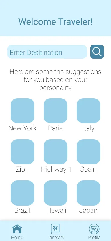
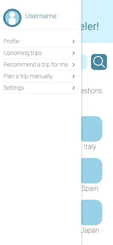
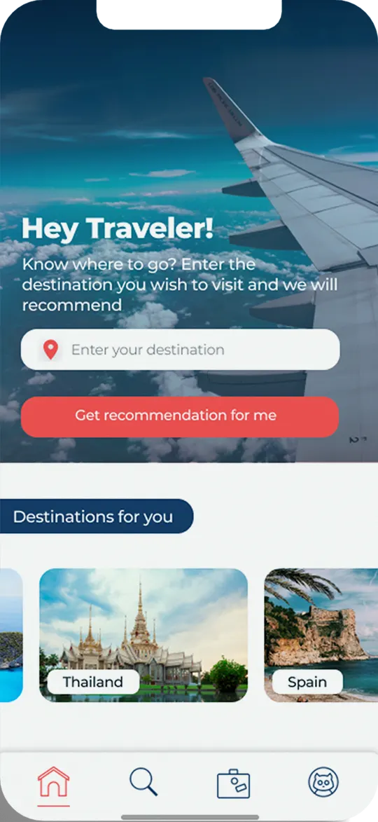
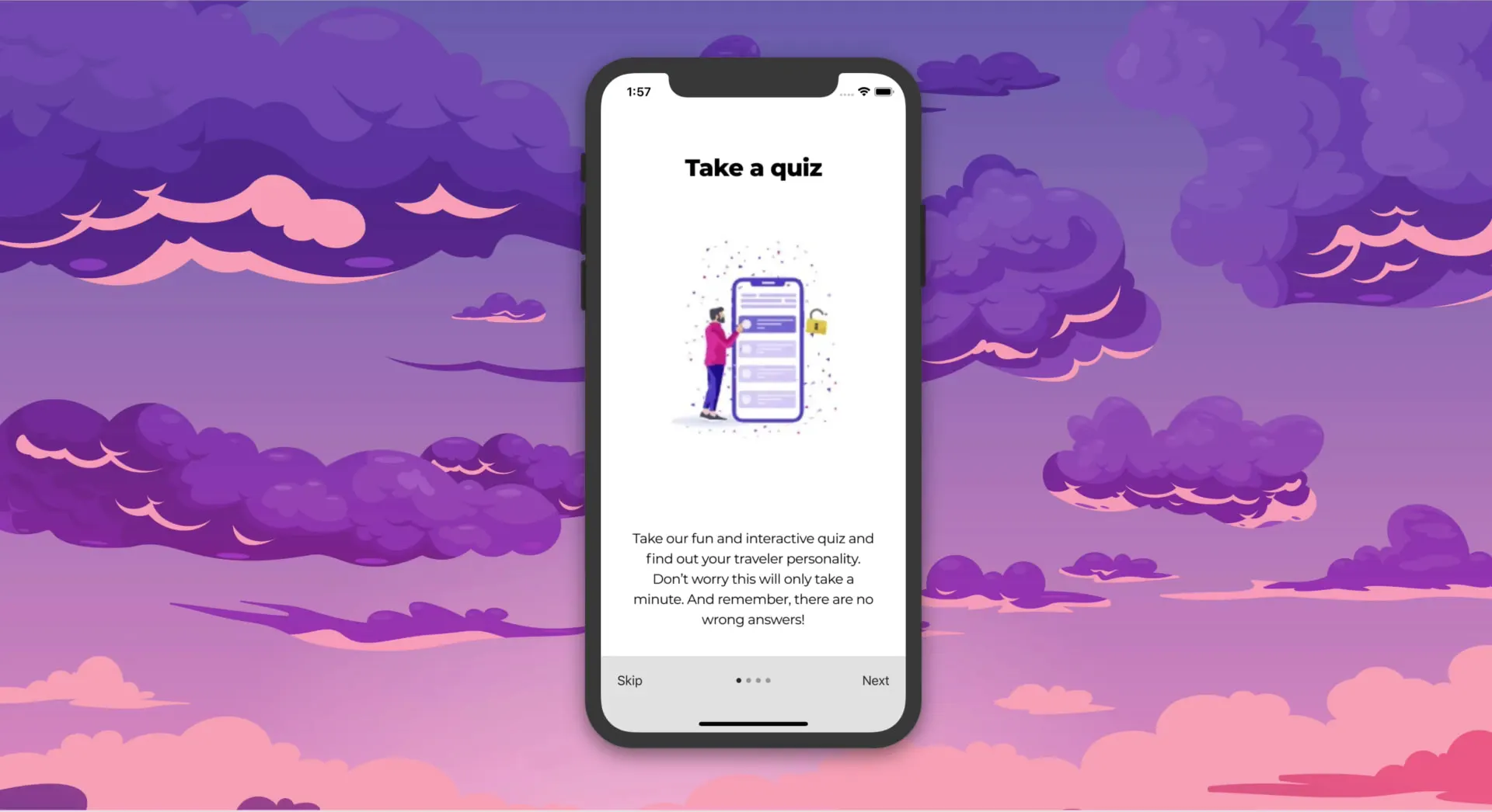
By the third iteration, the quiz flow and the personality result had finally lined up with each other.
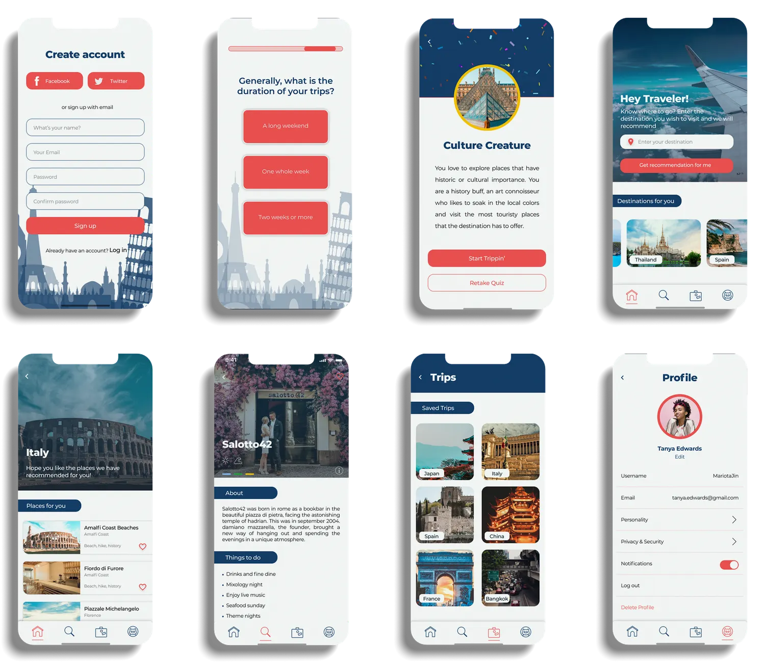
The final design stopped explaining itself and started asking one thing at a time.
The aim was a clean flow with only the right information on each screen and, above everything, a home that matched the personality result to the quiz that produced it. The design flow had changed for the third iteration, so the last pass was about making the two halves agree.
Which is why the finished home screen asks a single question, gives one primary action, and then shows you places rather than filters.
05 Testing
The first flow tested badly. Every round after that removed something.
The design started out complicated, and people told us so straight away.
Testers didn't understand several of the features the first time through, and the flow looked complex before it looked useful. Over further rounds of testing and iteration we narrowed the scope until the app matched the way people actually think about a trip. The results at the end were good.
Three questions decided every change: what did the testing say, how long would the change take, and could it be built at all. That last one is what killed the most ambitious idea in the project, and the app is better without it.
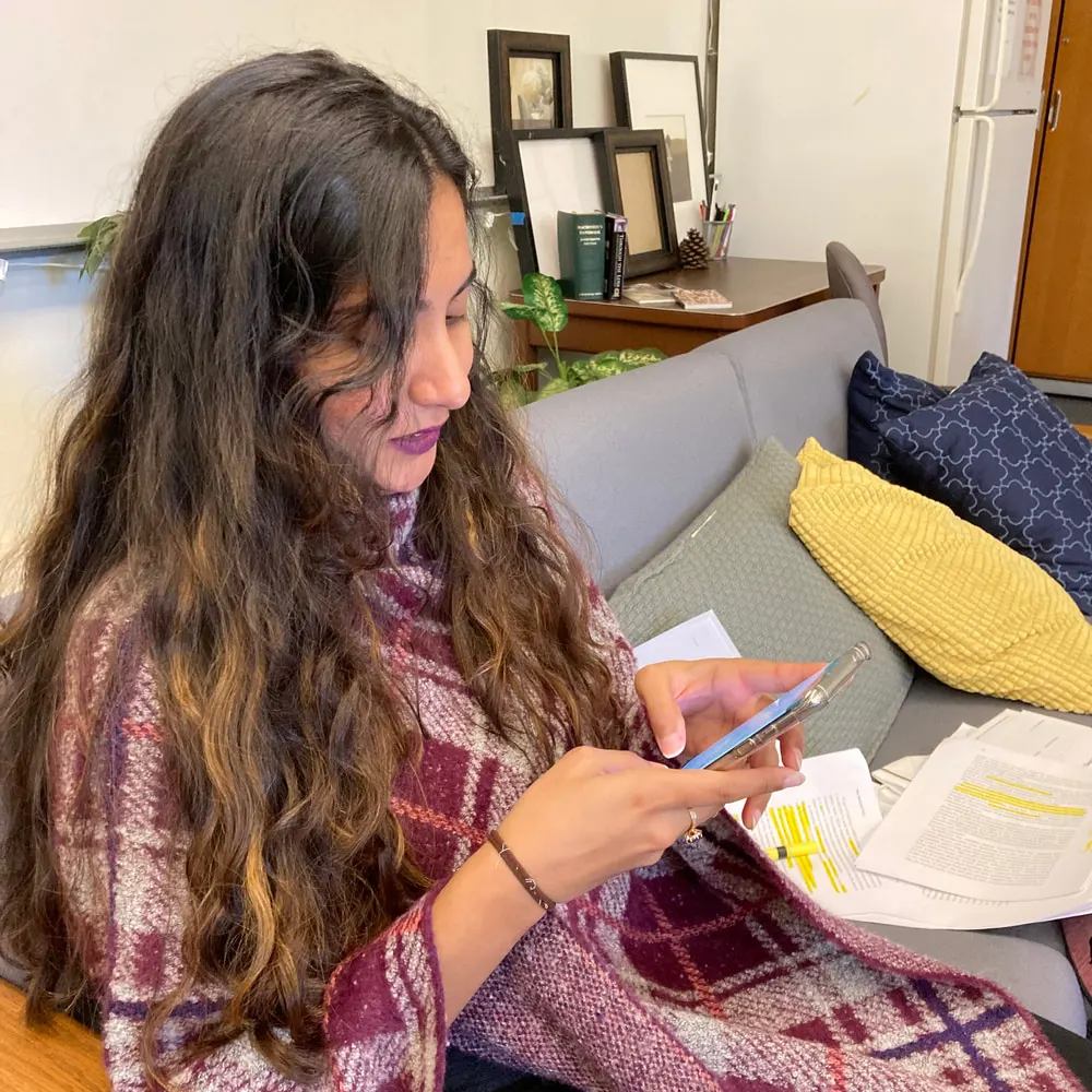
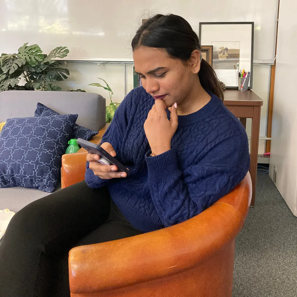
Every round of testing took something out of the app. That is what finally made it usable.
06 Next steps
We proved it for five personalities. The version after this one is twelve.
We validated the project for 5 personalities; the future scope is making it work for all 12. The dataset is Italy only, so the same groundwork has to be repeated country by country. The foundation of the recommendation algorithms is laid; the next step is making the content-based and collaborative-filtering approaches work together rather than separately.
And the app recommends, then stops. Whether we keep building it or somebody takes it over from us, the next features are the ones that turn a recommendation into a trip: a geolocation feature that enables route planning, a plan-a-trip flow, and booking.
A recommendation is only half a trip. Hodo got the half nobody else was solving.